Contemporary Test photoshoot

ST - Test shots

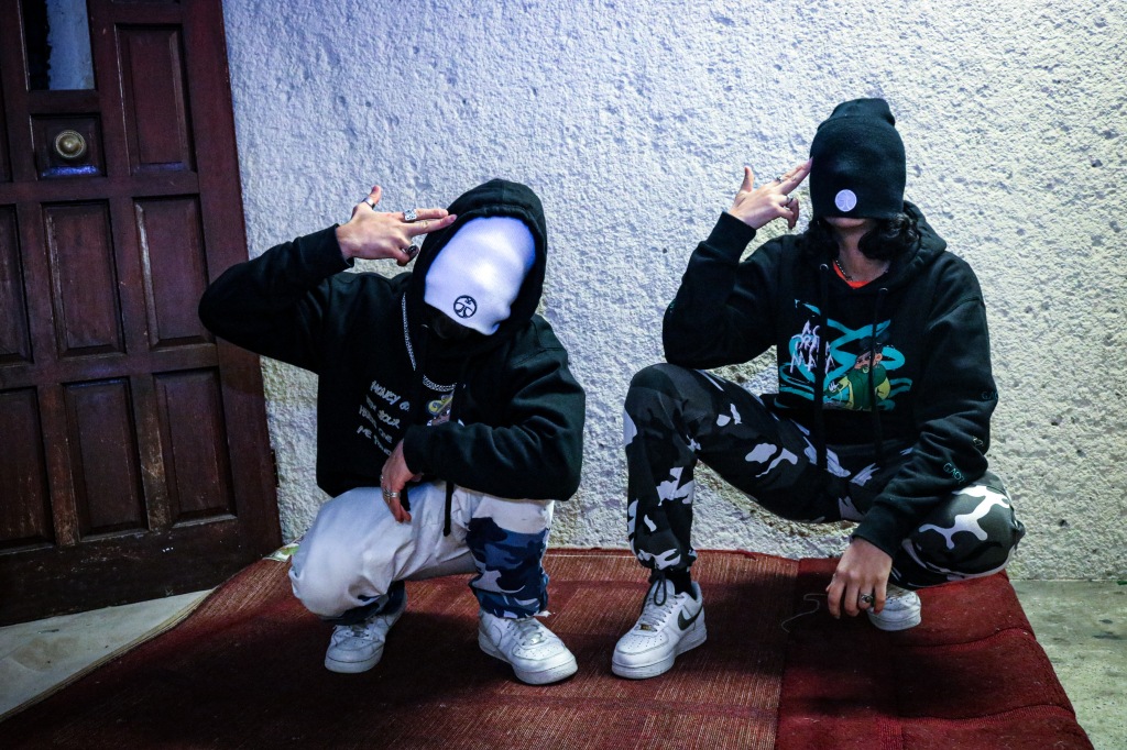
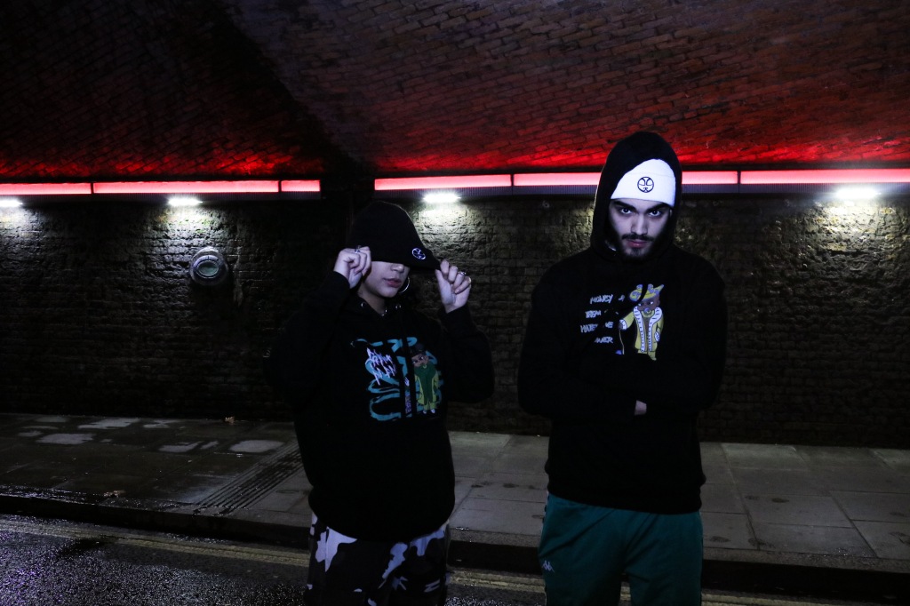
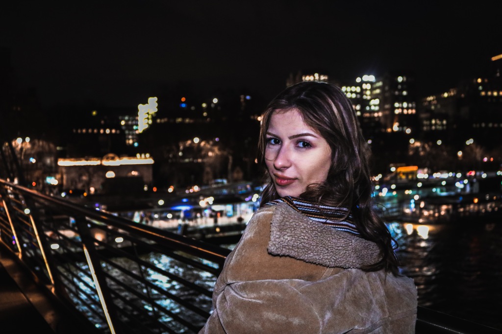
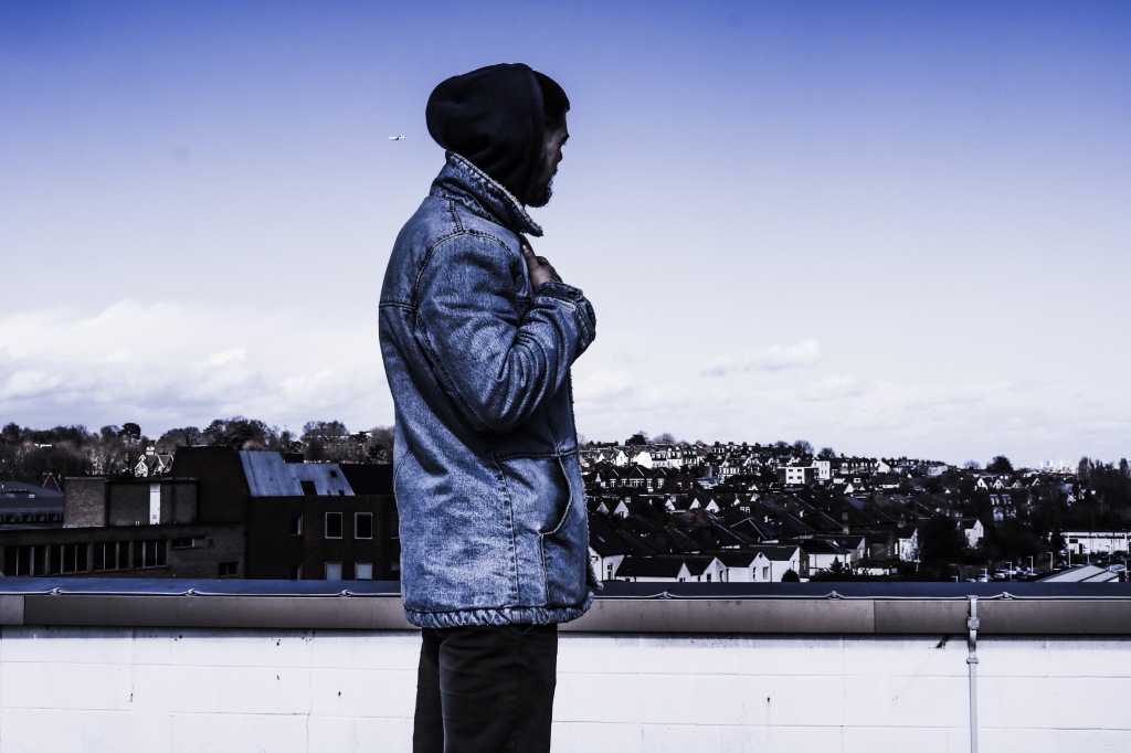
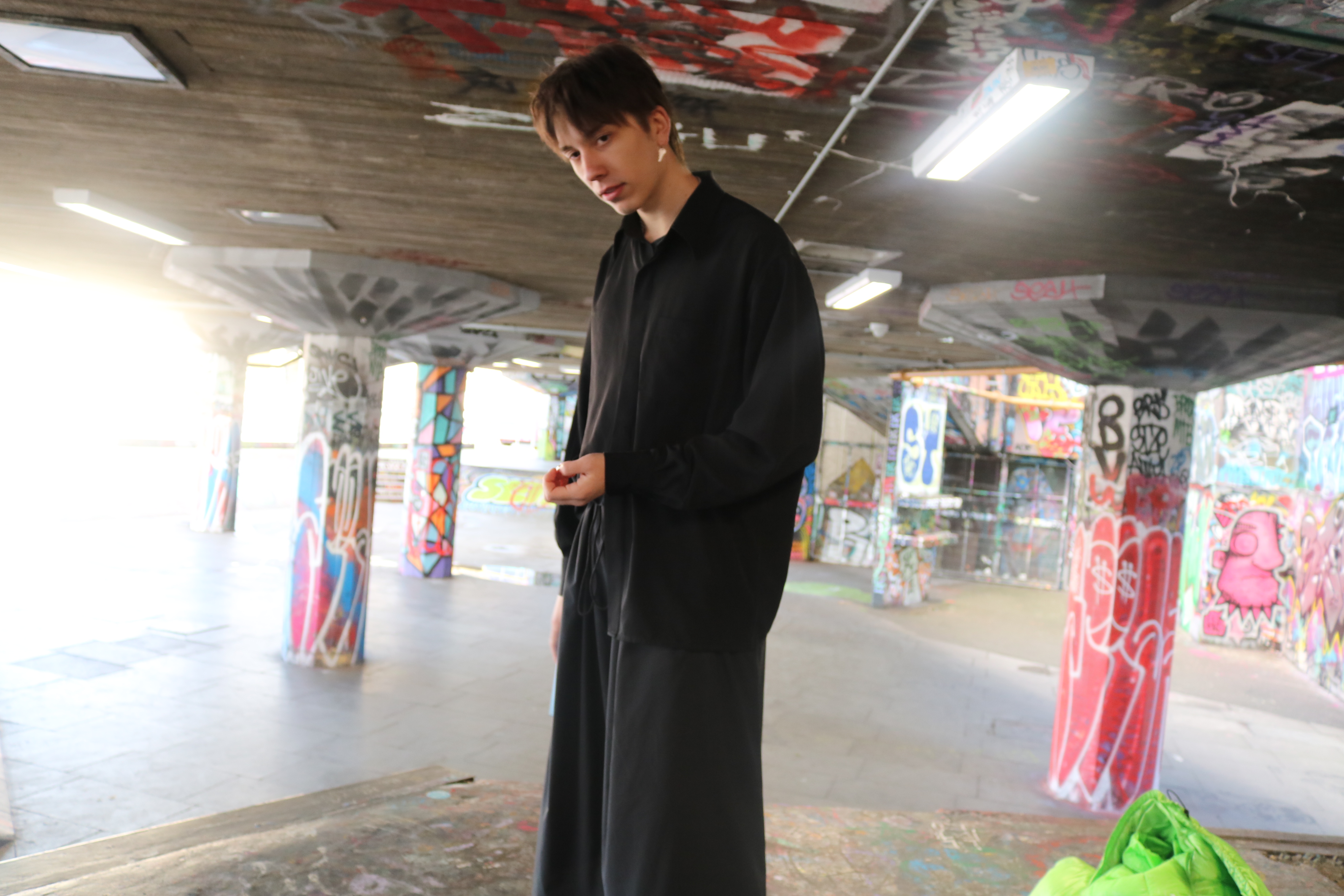
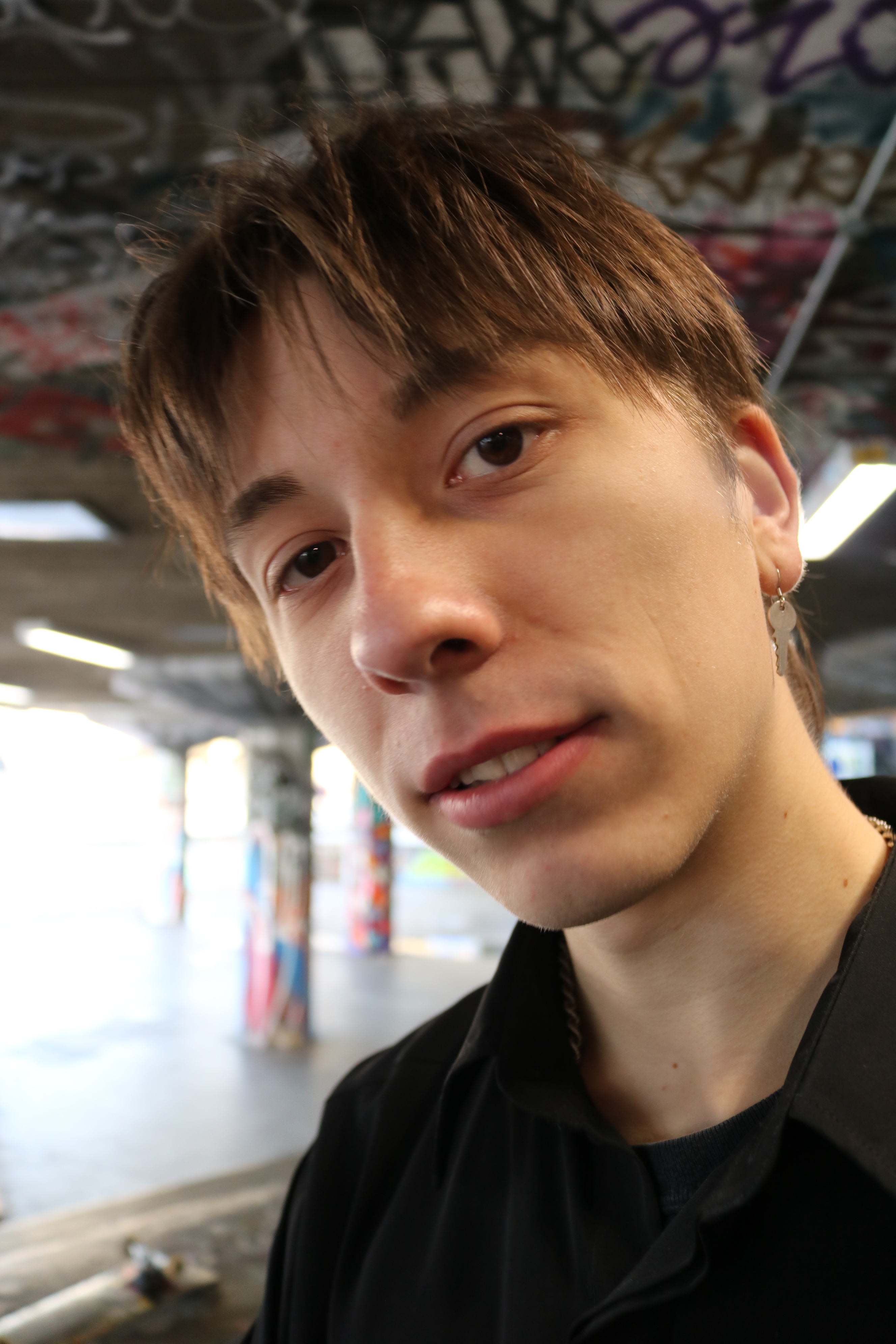
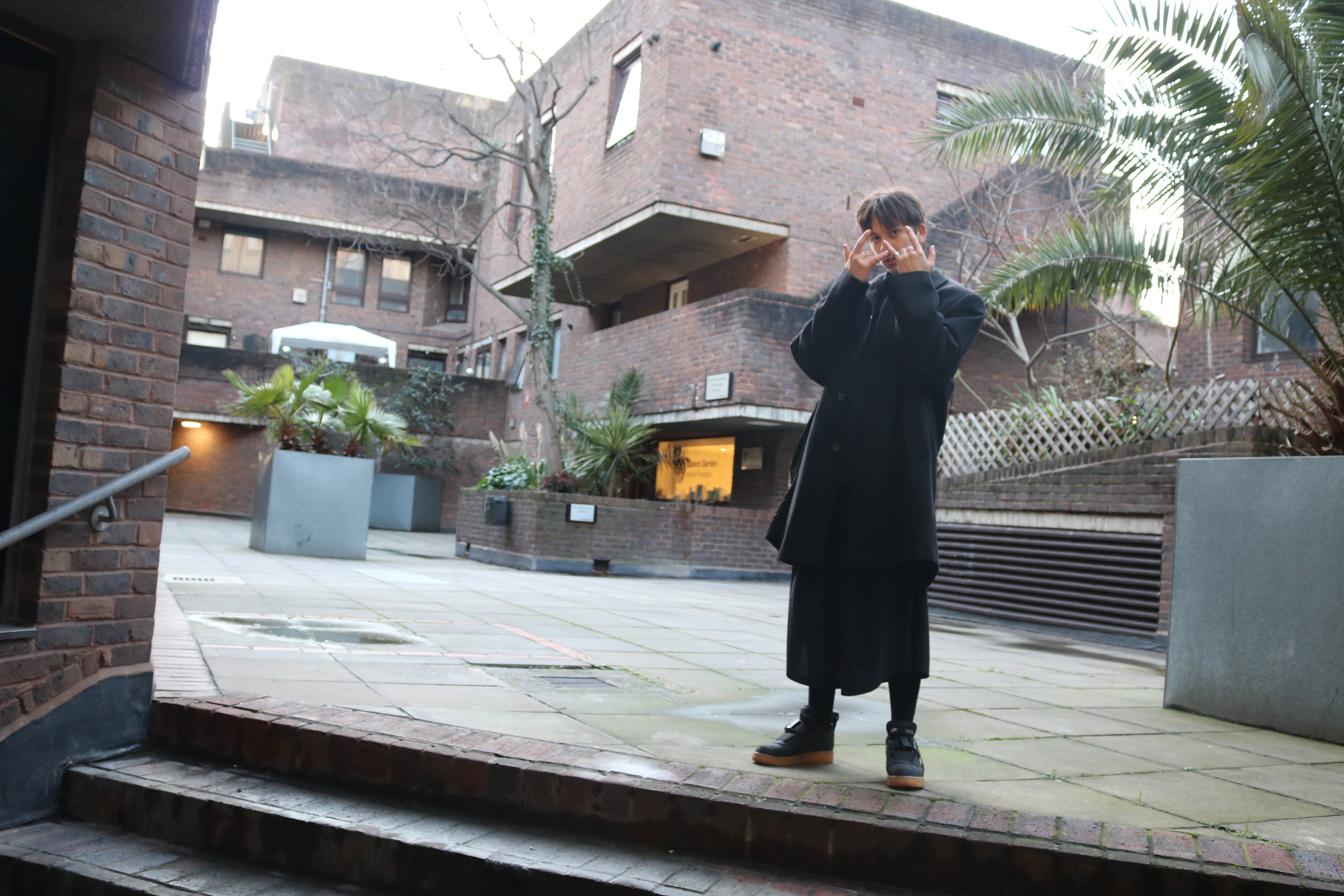
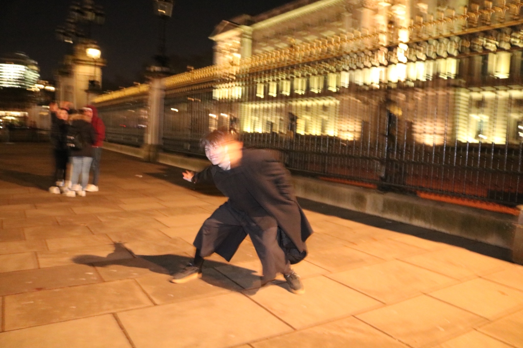
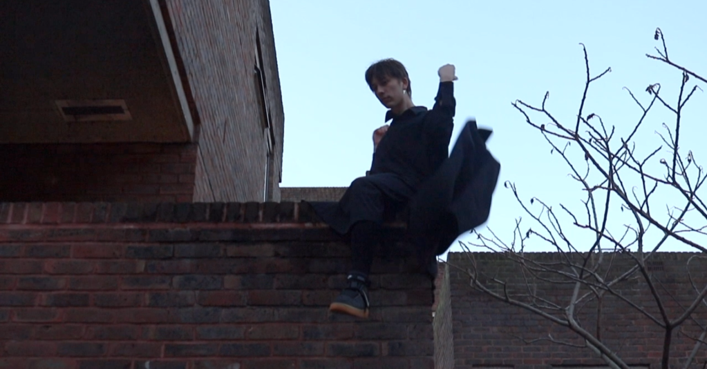
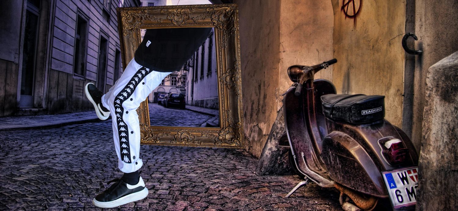
 My final test shoot included two great subjects who created their own fashion line. It was great working with different people and a clothing brand that is not released. The photoshoot consisted of hoodies, dark themed location, urban poses and modern compositions. I know for a fact that in the 1990’s photographers would not carry a photoshoot like this one and that is why I chose to do it. The photoshoot was carried out at night because it fitted well with the clothes, I wanted it to look edgy and not kind and cheerful. I wanted to get straight to the point, so we visited Vauxhall in London to take those photos in a local estate. The brand is about connecting different people together, and what is the best place for that? An estate where everyone is real and honest. 

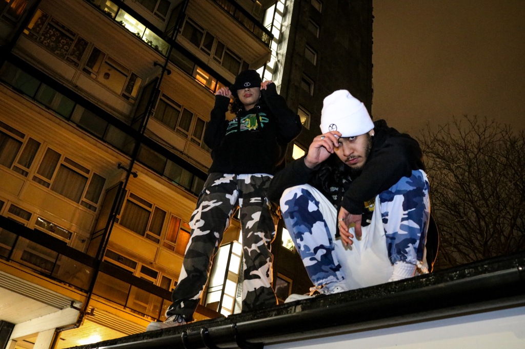
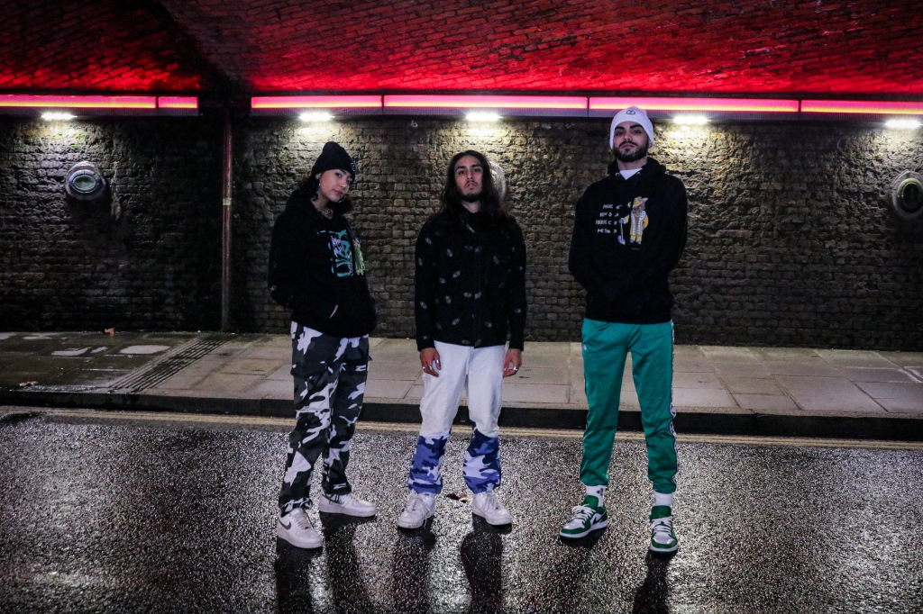
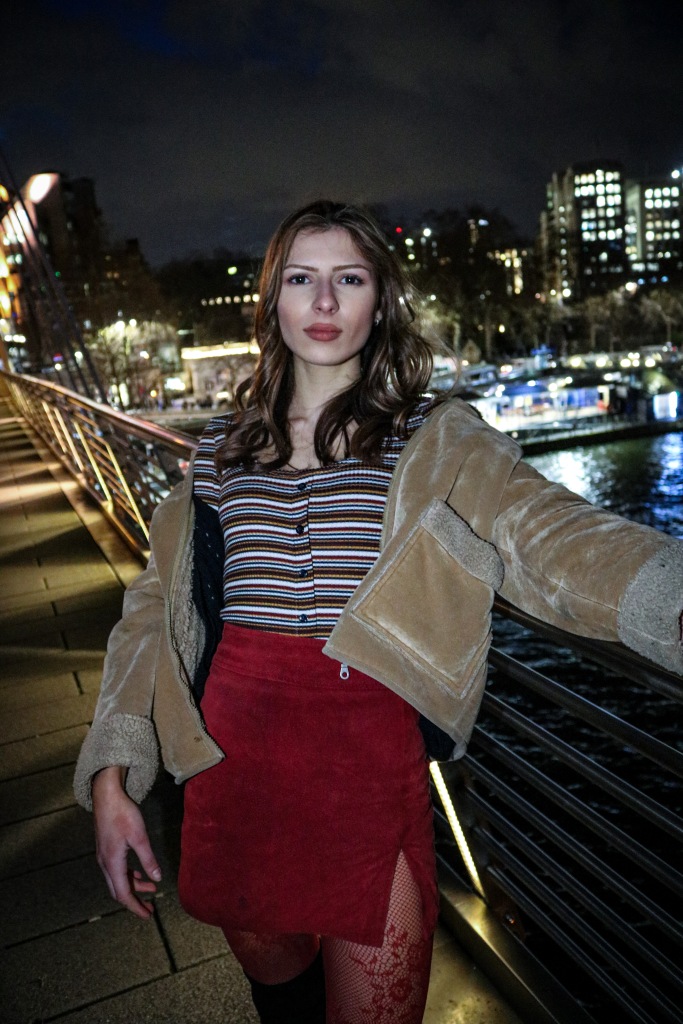
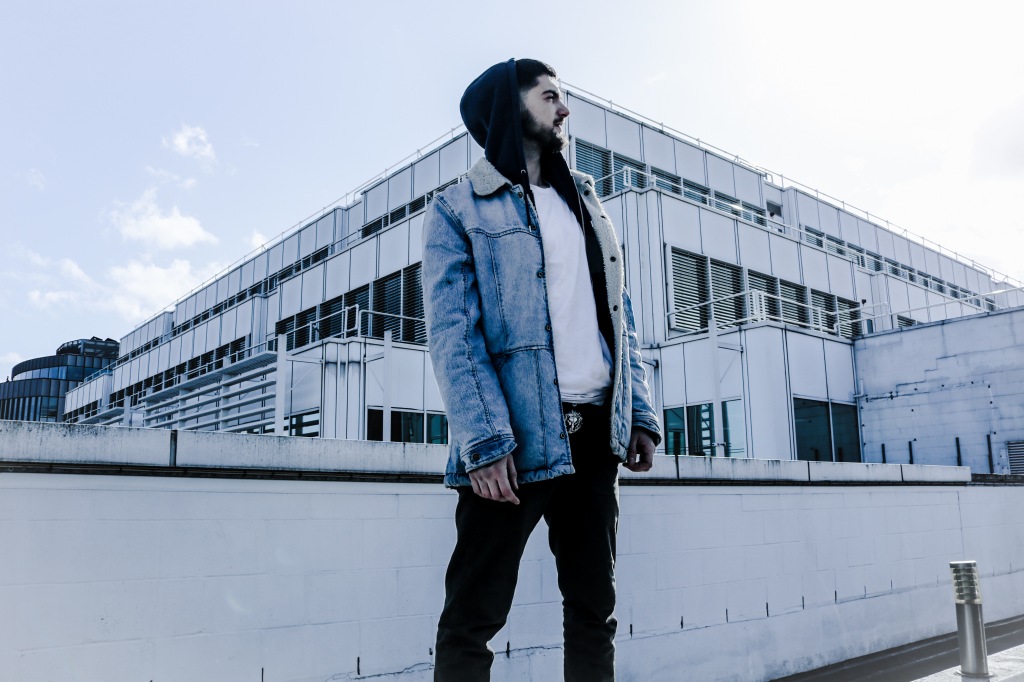
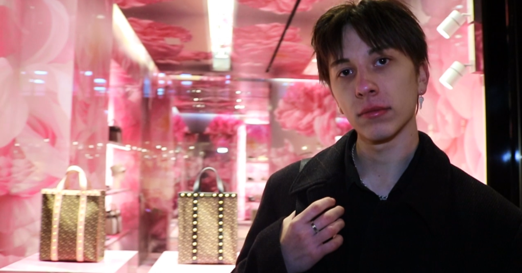
I have to say I had a little problem with the exposure and getting the lighting right however with a help of another friend holding a flashlight it enabled me to capture them just great. The lighting in the bridge gave a modern look to the photos because of the bright red-light strip on the edge, I loved it, it gave my models a red backlight which came out great. Another great aspect was hiding their faces and showing more the clothes as the designer asked me to focus more on clothes but don’t leave the model out of the shot, so I thought, okay if they can cover their faces with the branded hat, that could work out just fine. The apartments in the backdrop also gave a nice touch to the modern interface. Back in the old days, there was no apartments like this, therefore that was an awesome idea to include as well. Comparing to the previous test shots, I had an old looking inspired location with simple clothing, then this evolves into a more bright, more colourful and more busy background to this photoshoot where everything is new, the backdrop has lights and apartments and lastly this explicitly portrays my objective as a photo series. 

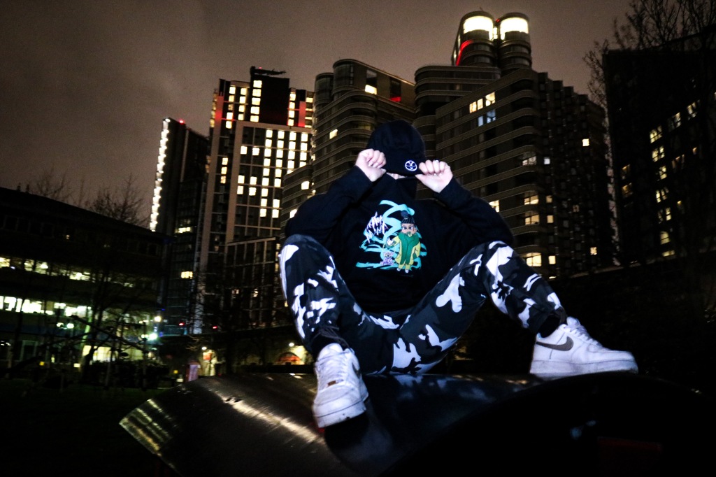
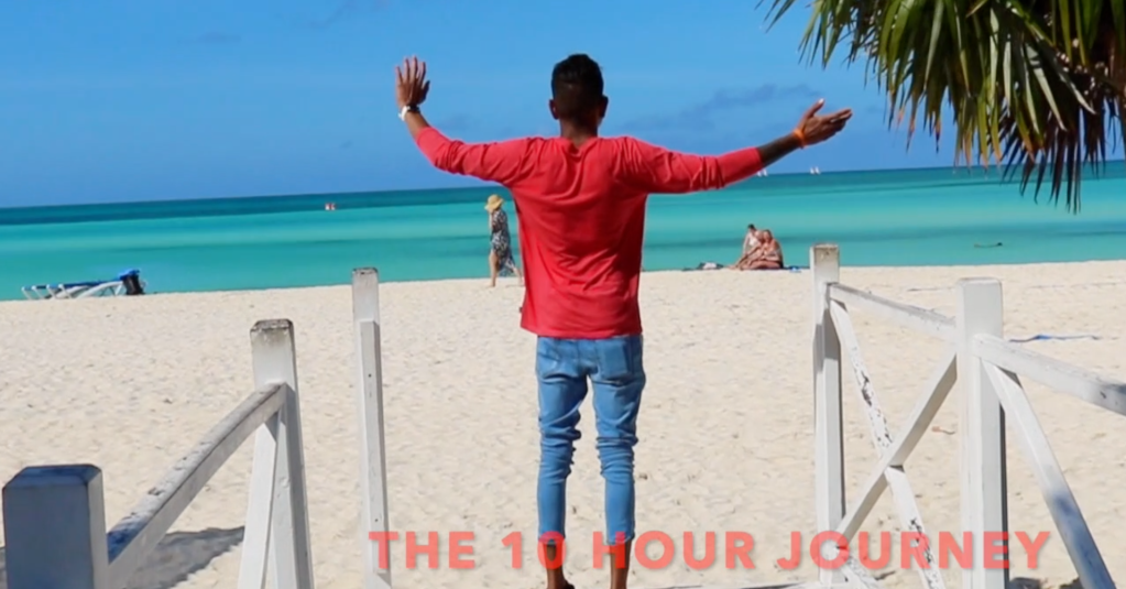
Moving forward with my main photoshoot:

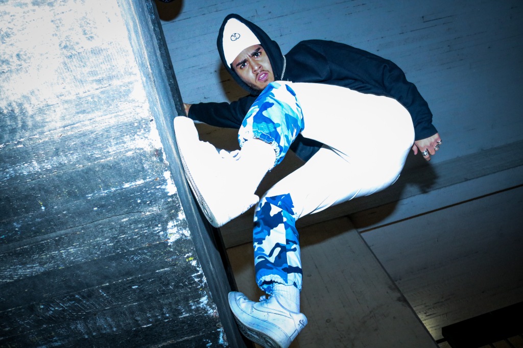
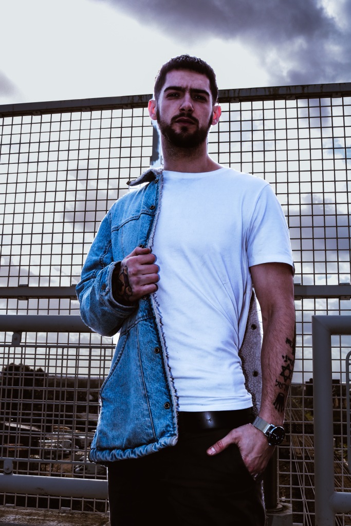
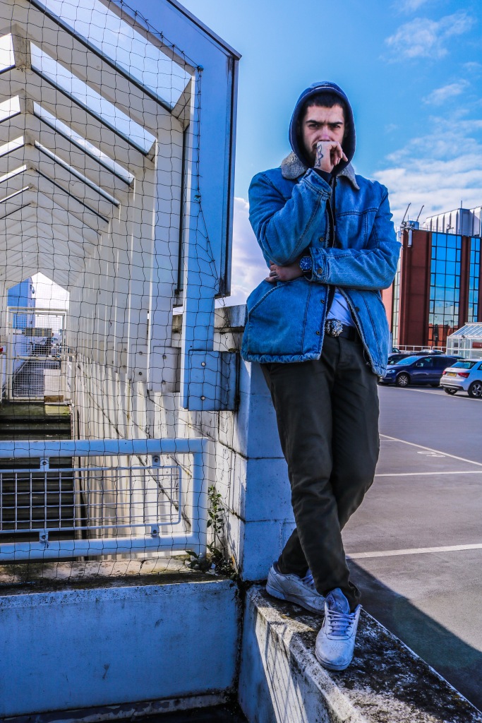
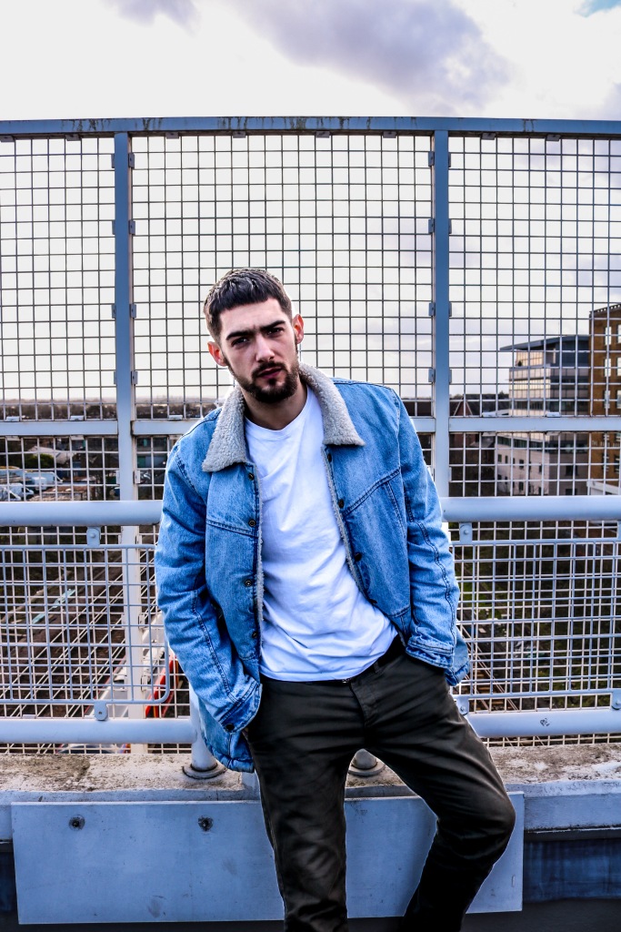
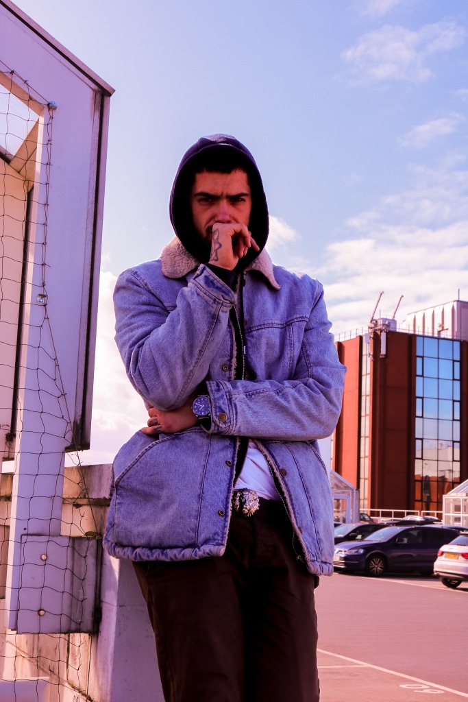
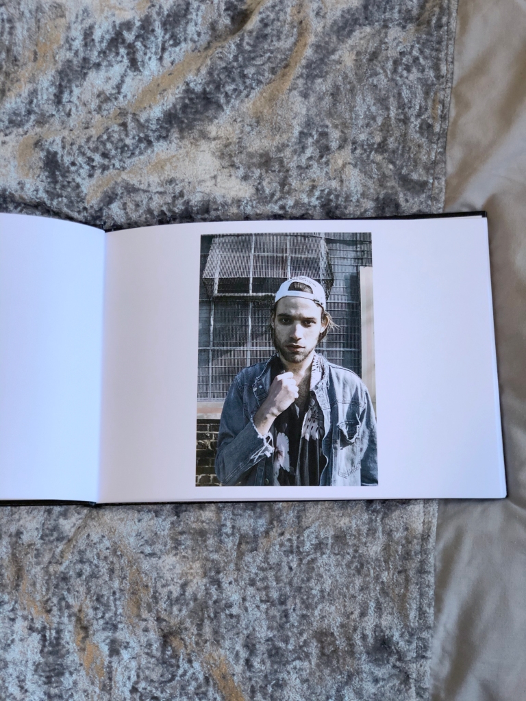
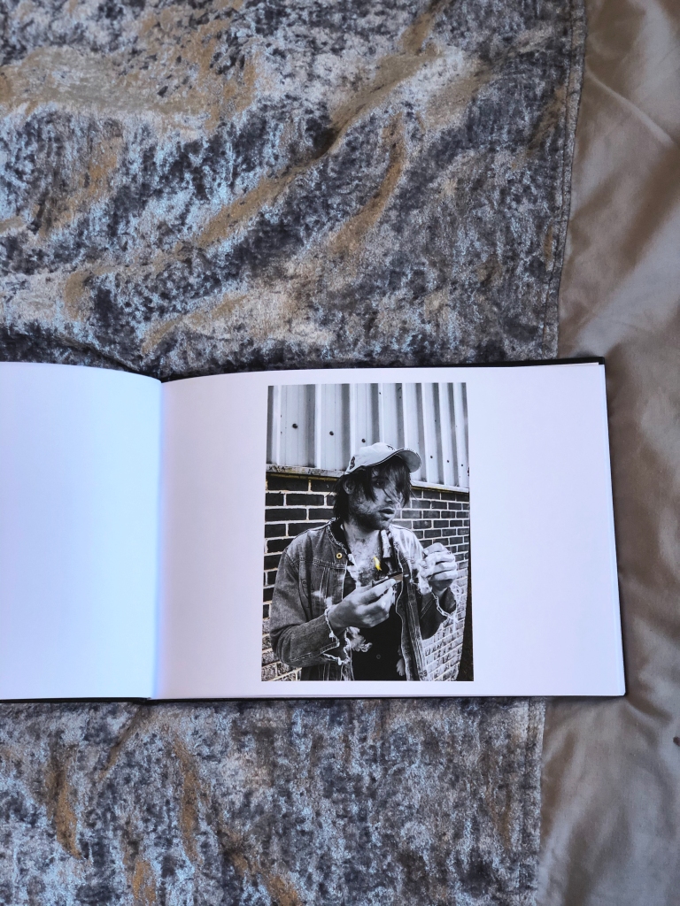
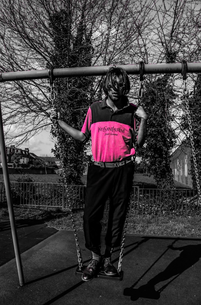
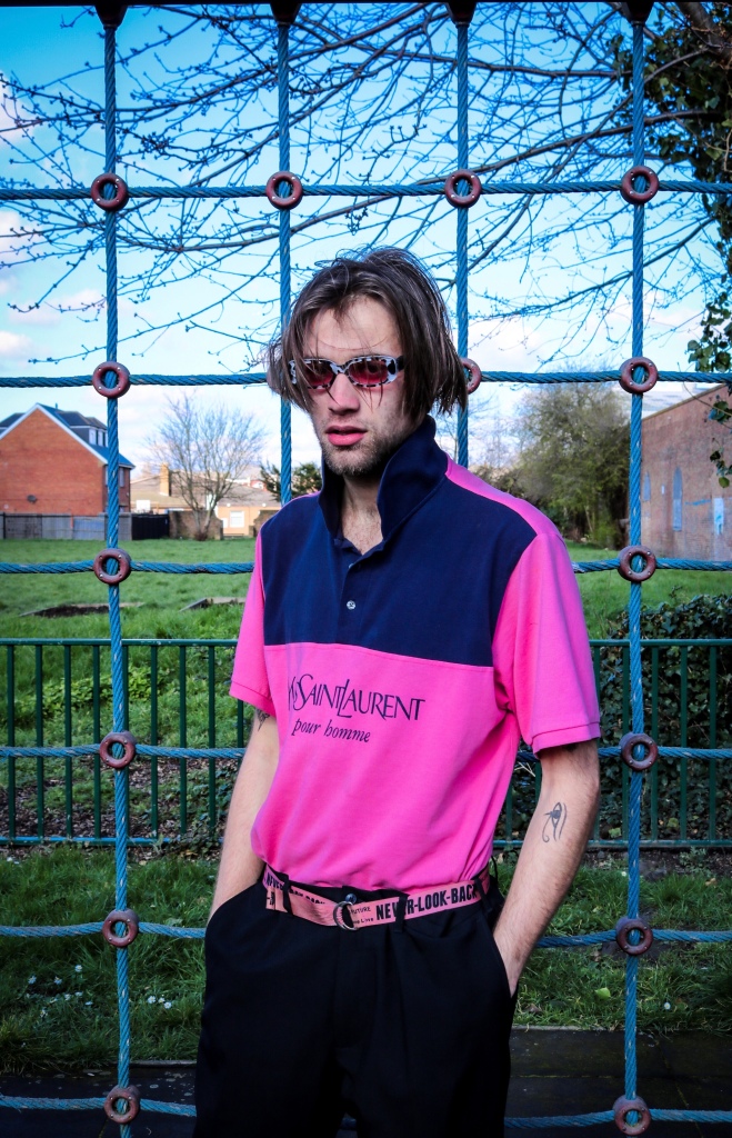
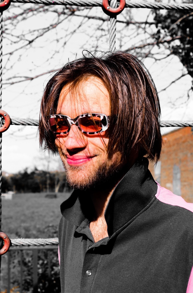
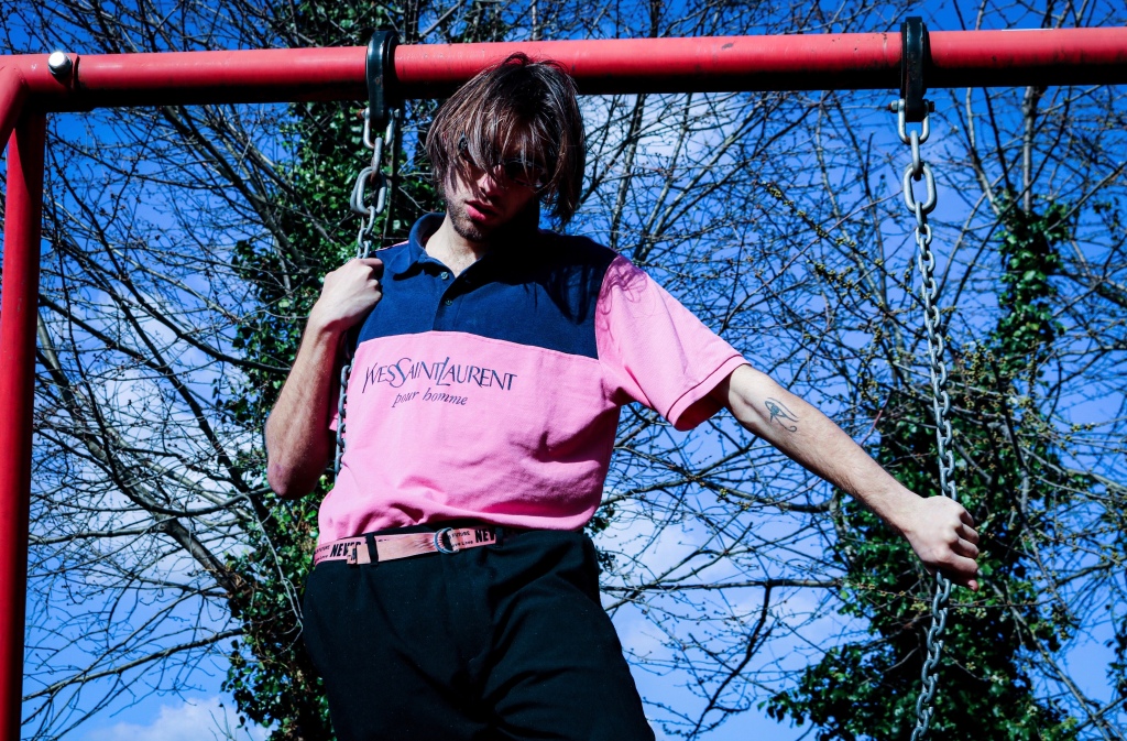
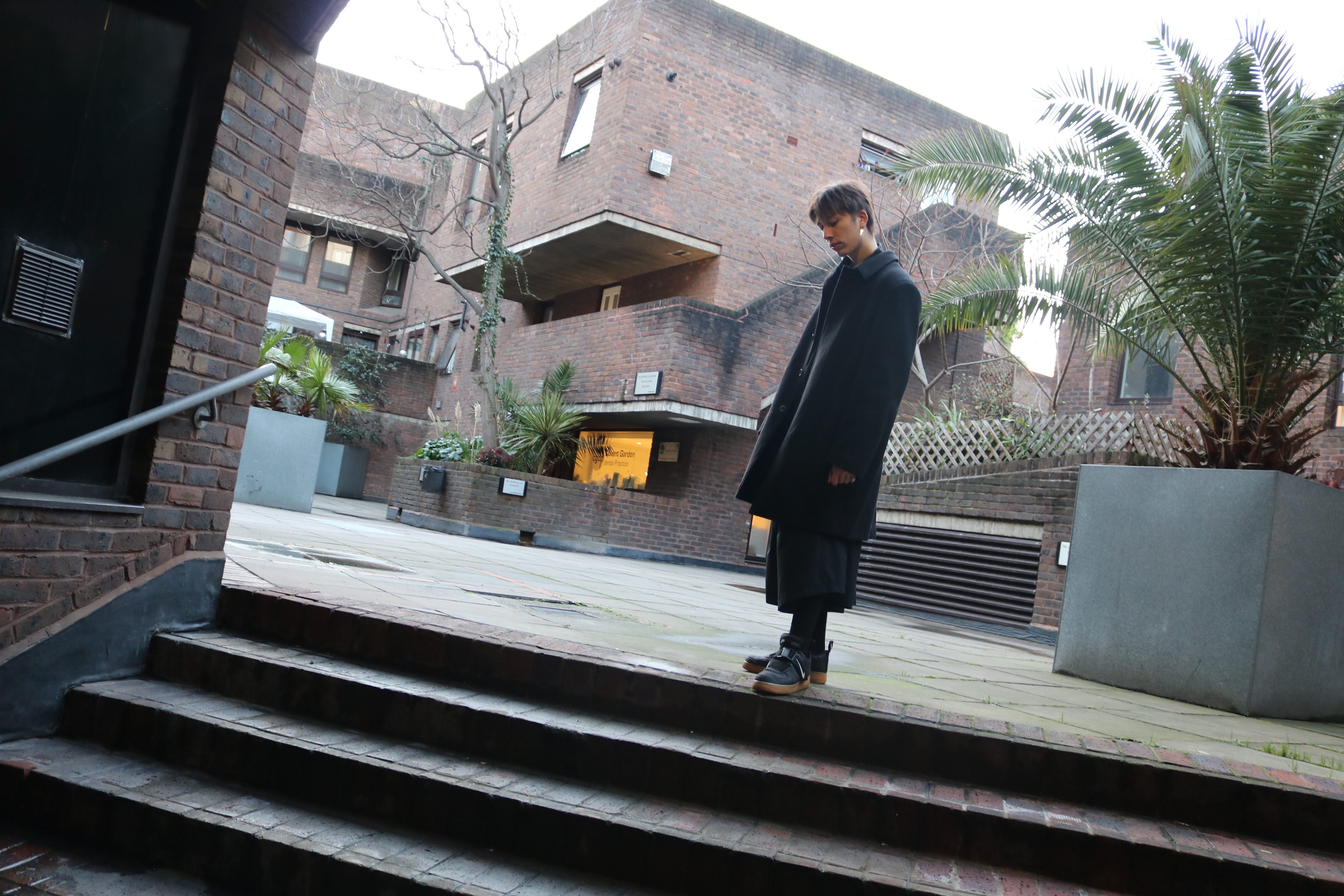
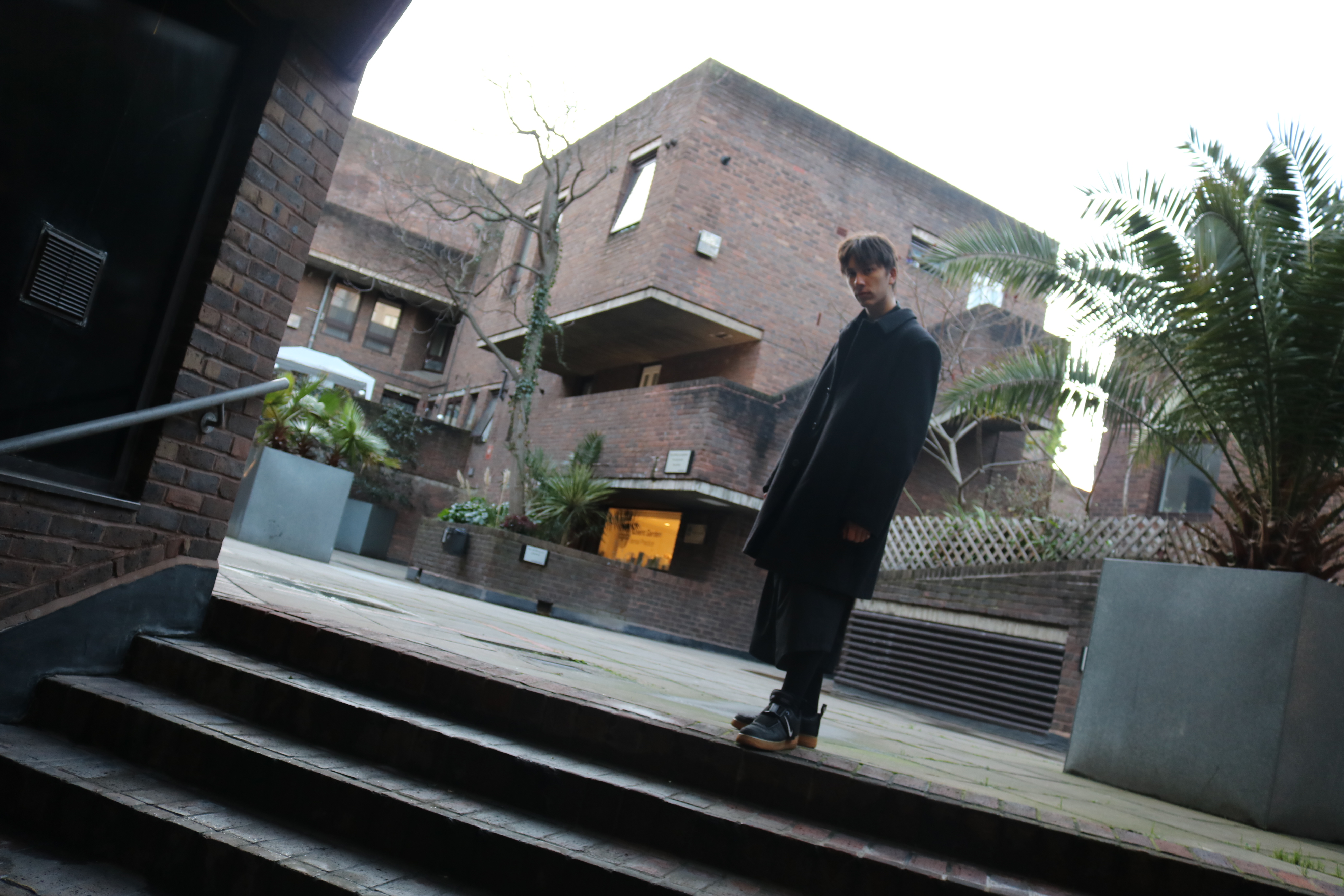
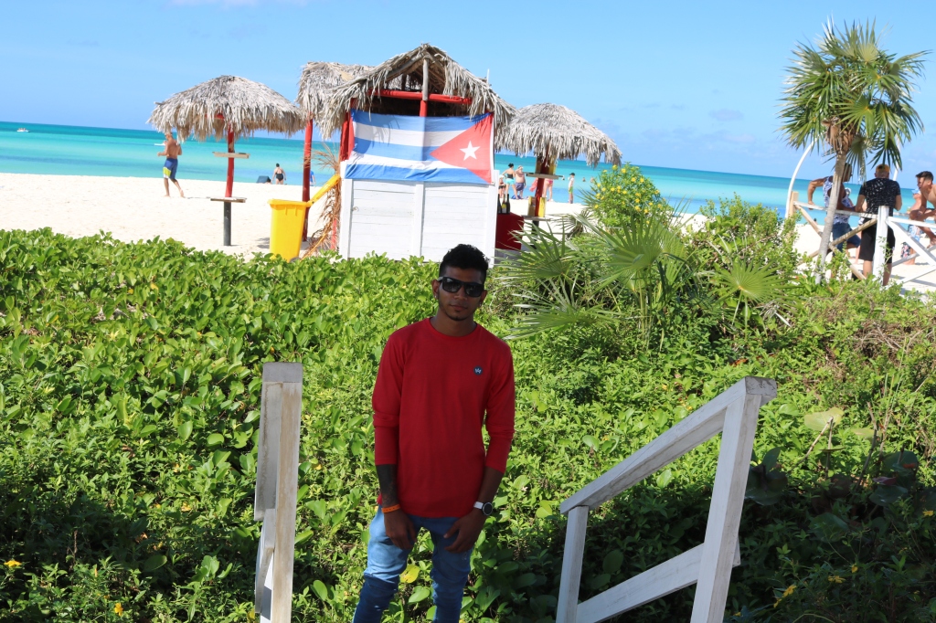
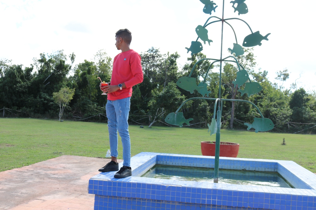
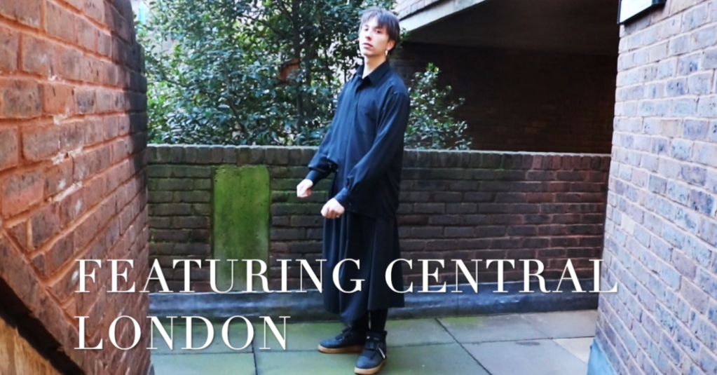
After taking three different photoshoots, I figured to use one, well fitted model that I’ve used before as he is very comfortable with me and have proved to me that he can listen to my directions in order to receive what I want. Victor, which I included in my first year, my skating in heels photoshoot and now my Evolution project shows his change in fashion itself. Looking forward to seeing how the projects goes on with him. 

Second Test Photoshoot 2006

ST - Test shots

This second test shot was based in Central London, in Southbank with a great female model, she was professional with the posing and done everything I asked her for. Working with an individual like that made me practice for my future career and in my opinion, I cannot wait to be in the industry to work with professionals.

Going to the photoshoot, I thought about three things, “Face”, “Hair” and “clothing”. The face was important because from what I found out, in the 2000’s the face was really important tot get the message across. In this photoshoot, I wanted my model to be very comfortable in her clothes that I picked out for her, the nice striped top complemented her hair, the jacket was vintage which fits in the theme I was working with  and the hair which I kindly asked her to curl came out amazing in the shot. 

The location was picked in Central because I think it could be modern as 2006 is not as far from now than 1990, however it is also historic so it would fit perfectly in-between.

Moving to one photo that is attached to my post is one of Catherine which I done a shoot just before the central London one. I wanted to manipulate the image and use my creativeness in photoshop. I masked, cropped and manipulated the image so that the background was a Graffiti wall as the biggest thing coming in the urban style was skating and graffiti which I wanted my main photoshoot to include. I’m big on the skating culture and fashion so the evolution of that style had to be inserted into my project.  

First test shoot

ST - Test shots

Here I can show you what I had in mind at the beginning of the project. The model I chose had a great physique and, in my opinion, looked photogenic on camera. The idea was to go to a roof top, have him dressed in denim with a plain white t-shirt as they did in the 90’s. As I knew this was only a test shoot, I was mainly focusing on if the model would fit the role in the main photoshoot I would carry and if the location would fit for the time era of 1990’s. In conclusion I decided I wouldn’t take him due to the lack of his backstory with fashion, he wasn’t interested into fashion or the evolution of it. Furthermore, the location looked far more modern than ancient, therefore I passed on that location too. I wanted to find something more industrial.

I used my Canon 750D to do this photoshoot, used manual settings to get the best lighting I could naturally and used a zoom in lens. My camera is not full frame however in the future I would love to buy a canon 5D to make my photography even better. 

Final Book Submission

ST - BOOK, Storytelling

Here I present my first ever Fashion Photobook for the Storytelling Unit. The book is in a hardcase style in black leather on the outside to add a little texture for my audience and the paper inside is in high quality gloss as I wanted the colours to stay shiny and vibrant. My book is made in A4 size and it was made in Snappy Snaps which I’ve been working with for a long time and I trust them to develop my work and projects. This book contains one image per double page to keep it clean and not too complex for the viewer, this book contains an information page with the model, location and the photographer which was me, I didn’t want the book to include any other texts as I think that the photos will tell the story I wanted to illustrate. I believe the colours work well on the pages and are not faded, the overall quality is amazing, and I wish I could show my teachers personally because I think they would officially like it and see in real life how great the prints came out. 

As I said in my Statement of intent, I wanted this book to tell a story of the evolution of different fashion styles throughout the years. In my opinion I have explicitly and successfully performed that. Below I am showing the final outcome of my book with edited digital photographs by their side for submission. 

Statement of Intent

ST - Statement of Intent, Storytelling

For this unit’s project “Storytelling” I want to show my audience the evolution of men’s fashion from the years 1990’s till the late 2000. I want to showcase my photography in a hard case book which would make my photographs look clean and professional. Page by page the Book will tell a story of fashion clothing evolution, it will consist of three separate photoshoots with the same model. Furthermore, this model I picked fits perfectly because he himself has changed his style over the years. He never was into fashion, big brands didn’t tell him anything however about a year ago he got introduced to Skateboarding, which further intrigued him into fashion and its labels. Additionally, by talking with skaters, photographers, designers and influencers throughout skating he got more and more into what fashion is and how it impacts the way people look, judge and cooperate with him.

 By having one male model I can focus on sorting garments for him only, this will include digging for old parents’ clothes that they wore when they were younger to make it more genuine, in my opinion the recent “90s” clothes are overdone, they don’t look too vintage. For example, they colour isn’t faded, there’s no stretches, stains and so on. I will need to use an old denim jacket, washed jeans, polo cap, shirt, leather belt and most likely vans for footwear as skating was a big thing in the 90s. For his hair I would Like him to have messy hair, all over the place, this will later be changed throughout the other photoshoots by not having the hair out or not having the hat at all. For props I would like to simply have a Zippo lighter and a cigarette as people back in the 90s would still think cigarettes were a luxury. Lastly for the background I want to have a simple Brick wall with an industrial touch. Having some metal, bolts, old windows and cages would fill in this ancient atmosphere into this time frame. 

Then I will look up what trend for men were stylish in the 2000, I’ll focus on the year 2006, a lot of trends boomed such us popped up collars on men’s polo t-shirts, spiky bleached hair, distressed jeans, and patchwork denim jackets. Simply I want to show a funky, colourful and funky theme. For the clothing I would like to choose a polo T-shirt, smart suit trousers, formal shoes, animal print sunglasses and an industrial belt. The shift from on to the other is mainly colours, prints and the hair. Here I don’t want a hat but have him with middle parting as it was impossible to have his hair spikey and he didn’t agree to bleach it. For the Location I will possibly choose a playground as I can have different perspectives and angles such as low close up shots on the slide, portraits by the climbing frame and some shots on the swing.

Finally, the last photoshoot will focus on big label brands such as Givenchy, Balenciaga, The North face and Polo Ralph Lauren. I want the hat back as caps are coming back into the streetwear again this year, I want him with High end sunglasses and sneakers. Keeping away from industrial, rotten and old themes, I want to portray this out contemporarily with glass windows/ buildings and strong full body shots. 

Overall this story should show the different fashion styles in different years, the postproduction will be done in photoshop, I want to make something new and experiment with colours. For instance, have only one colour showing the focal point and having the rest in monochrome, or either having some colours pop out to make it more interesting. I hope this project will come out successful in what I want to show my audience in the long term. The Book can later be used as part of my portfolio so therefore this project is allowing me to plan for my future.  

Fashion film inspiration

Fashion Film

I recently viewed an amazing peace of art featuring the one and only Cara Delevingne. The video is set in two various places on the beach, on a high swing, in cars and on a pier. That really motivated me to respond to this video and have rapid cuts during the clips, have energetic music and that’s what people tend to associate beaches with- fun and exciting vibes.

Here you can see the model on a high swing standing rather than sitting because why not right, it shows that she is ready to push the boundaries.

Here is my favourite frame from this fashion film, the screenshot looks like the shot was taken out of paradise or from a painting. In my resort in Cuba I had a similar frame of my model walking down a pier onto the beach backwards. It shows their journey, they interaction with the beach.

In contrast to this video clip I decided to choose a Nike advert featuring a known English grime rapper called SKEPTA. The video swooshes from scene to scene rapidly after a simply phone call that SKEPTA is having. I really liked the quick transitions, the fast forward and slow motion effects. And the locations that were used really inspired me to visit them myself for my own video.

For instance a simple corner shop:

Another one is on the street, this ahit is fast forwarded:

Having people dancing:

And lastly I would like to talk about the choice of music as well. The producer and maker of this short clip used many British grime tracks as the main character sings in that genre. It simply shows how much, sound, audio or soundtracks mean when it comes to editing fashion films. If for instance this had a county or pop song it would really relate. Moreover it’s a Nike brand and that’s a sports brand which means when you exercise you listen to upbeat and fast songs.

Evaluation of still images

Fashion Film

Apart from creating a video, I also intended to take a couple of still photographs to further explain the clothes and the environment.

This photograph is a cloe up, eye level shot of my London model, I want to show you his hair, eyes, his ear ring and his jawline. This photo was taken in Southbank, Waterloo in Central London.

These series of photographs were taken in an estate close to Picaddily Circus. I wanted to show a rougher area in London compared to some Mansions and Luxury hotels. London streets look amazing but compared to a walk down the beach its really nothing.

This funky shot was taken using the TV setting, by using shutterspeed my subject moved and it created a movement trail behind him. You can see his head movement in this shot. Buckingham Palace was the place were this photograph was taken.

Moving forward, Here are some shots of Curtis in Cuba. The first photo shows him posing infront of the beach, followed by a hut including the Cuban flag and a nice plant area. The background builds up as we look more and more into it.

This image was taken in the pool. I wanted to show how great life is in Cuba compared to a cold and rainy weather in London. There you could barely wear clothes as it was siply too hot to.

Lastly, I present screenshots I took from my fashion film. The first image shows my subject enjoying his life on the beach. By having his hands in the air, it shows how muchhe praises the beach and how delighted he is to be there. On the other hand Konrad seems a little more drained of life, the constant walking was making him tired however he gave his best like always. The third image shows Konrad on a high ledge. I wanted to shoot him there posing for the camera and then by slowly taking off his jacket and dropping it, I expose what he wears underneath. The effect of him making it fall so casually really made me like this frame. Fourthly, you can see Konrad in front of a High End designer Brand called Burberry. I didnt want this shoot to be cliche and have footage taken in front of fashion brands however I decided it would be thoughful to atleast include one. The only reason why I chose this window was due to the display, the pink, floral and contemporary setting really caught my eye and though it could link to the red light clip I have of Konrad towards the end. I fast forward that clip due to the fact that he had slow movement in the original footage. By fast forwarding the clip I created a great moving image of Konrad

Evaluation of Editing my Fashion Film

Fashion Film

Starting to edit was my favourite aspect of this project because this really pushed me out of my comfort zone, I never professionally edited any videos to make a narrative and make it look interesting apart from short Instagram videos. I started off from importing all my videos and photos from my photoshoot to a made folder on my desktop. From there I could criticise myself and eliminate videos that were not needed, were shaky or didn’t have much to offer. The strongest ones were labelled and sorted out in order from the date created. 

I then thought of what is going to be the story and therefore I arranged them into groups where I had Cuba footage on one side and London footage on the other. This way I could place them onto the timeline easily without them being jumbled up. 

Here you can see the whole set up of my editing software. I have my media on the left where I could easily access them, the frame window on the bottom with the audio file and the screen where I could preview the clips on the right. 

Before editing the videos, I made sure each clip is stabilised completely so that I could only get clean and smooth shots. 

A screen shot of a person

Description automatically generated

This was my most useful tool, by using this dial I adjusted the contrast, highlights, exposure and black points of any specific clip I chose. Most films were shut during natural daylight and didn’t really need heavy correcting however the footage shot after sunset needed some shadow and contrast correction due to loosing detail and colour. 

 This was the function where I could adjust the audio to my clip. I was thinking hard about what music choice should I choose. I had an idea that I wanted rap because of the youth culture in London but then I realised that the spoken language in Cuba was Spanish and therefore I wanted to have Spanish lyrics. I came out to bring in the song by Bad Bunny called “Callaita”.  It was a song full of energy, it reminded me of the time I spent in Cuba and the words to connect such as the rapper singing about the beaches “playa” and singing about partying and being yourself, which is what Konrad portrayed in London.

My software allowed me to modify the clips by using slow motion and time lapse to create effects interesting for an eye. The slow motion was used to really appreciate the view and the clothing whereas the fast forward function was used for more rapid movements such as dancing or walking. 

Here you can see the Titles page where I Could insert text on top of my video for credits, quotes and locations.  I used this to write: Damian Sliwa, Featuring Central London, and Cayo Coco in Cuba, Buy less choose well and do it yourself, la vida es simplemente hermosa, Curtis Luchanah and Konrad Kuros. I didn’t want to overflow the text as my audience would get too distracted therefore I kept it minimal. 

Whereas here I present the numerous transitions that I placed in-between scenes so the transitioning wouldn’t be so simple and boring. It does give it a nice feel and style to my work. For example, rather than going straight into the next frame, it transitions by fading or blurring into the next scene. 

Towards the end of the film I inserted some quotes that could relate to my video. I stated “Buy less, choose well and do it yourself!”. The purpose was to tell my audience that London is about being independent and doing things by yourself and not looking at others. People in London tend to choose the wrong clothes and manage to buy a huge amount of them too without realising half of the things were not needed and the only reason why they bought it was to stay on top of the trends rather than focusing what makes them comfortable. 

In contrast with the English quote I had to insert one is Spanish. This translates to: “Life is simply beautiful”. I wrote that because the scenery I present in my opinion looks magical and it’s a shame not to say what a beautiful life I had for that one week in Cuba.  

I ended my fashion film with two moving images of my two main models, Curtis and Konrad. I titled their names in transition instead of doing a credit page as I don’t think it was necessary due to the already made length, it simply would have made it too long. The arrows facing each other are symbols that a transition is being used in that area.  

To conclude the edit took me a whole rough day to do which I am happy with because the soundtrack goes well with the video, the footage is not shaky, the colours are vibrant, and it has a great narrative of contrasting two different worlds.