Styling Identity Essay

Essay, Styling Identity

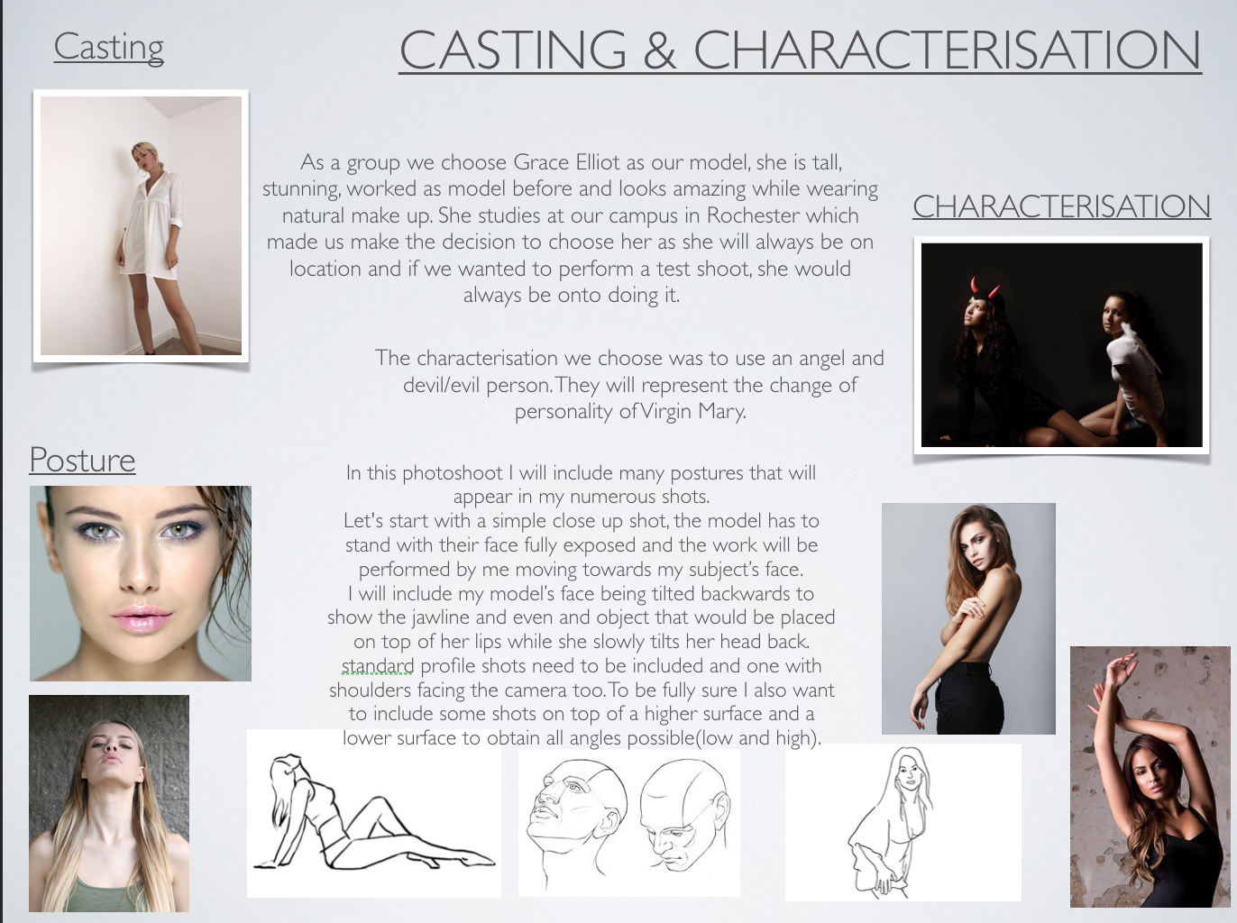
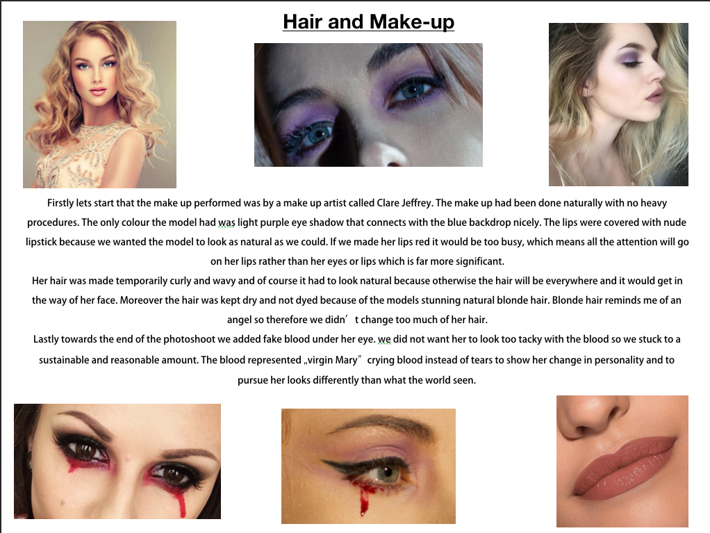
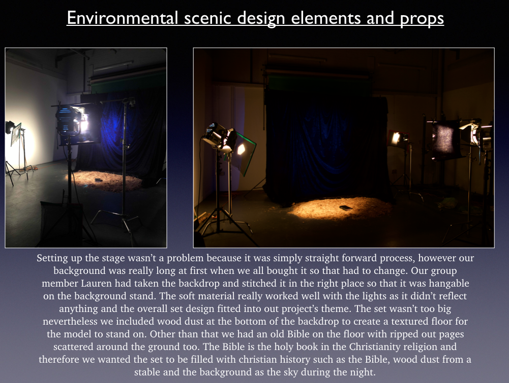
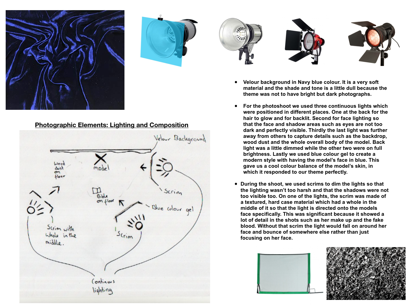
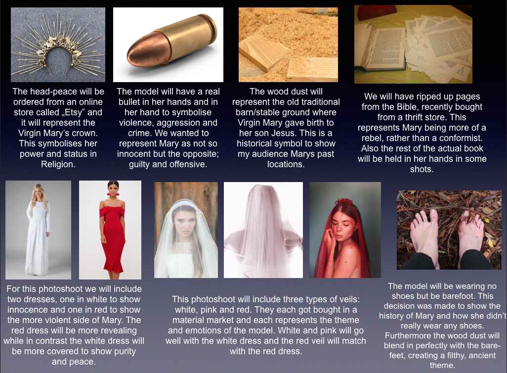
Beauty is difficult: 

Discuss this claim with reference to the fashion industry’s representation of the body within fashion photography and advertising

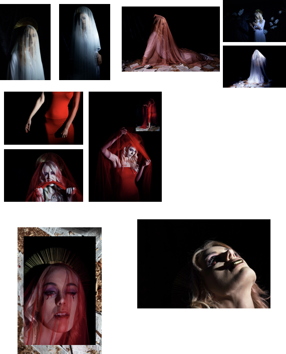
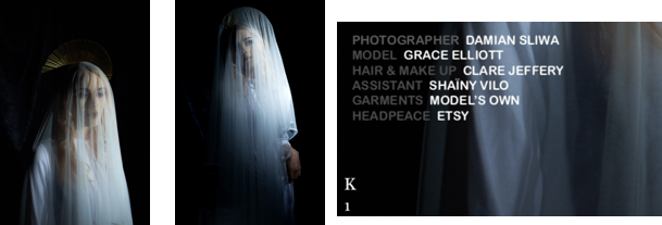
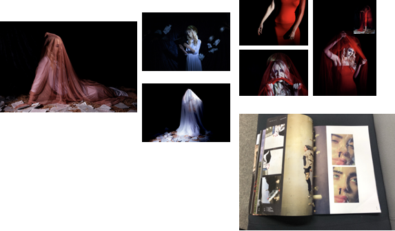
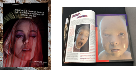
Today the world perceives beauty as something that resembles dominance, wealth and power. ”Beauty is pain”, ”Soriano, M. (2017). Beauty is Pain: Photo Series Shows the Dramatic and Painful Lengths Women Go to for Beauty. [online] Rebelcircus.com. Available at: https://www.rebelcircus.com/blog/beauty-pain-dramatic-painful-le/%5B-women-go-beauty-2/ [Accessed 14 Jan. 2019].” is one of the most well known sayings regarding the difficulty of beauty, personally I believe this saying could be originated from the Victorian era when they used to wear corsets as they thought that having a smaller waist was perceived as beautiful and attractive even though it was difficult and painful to achieve.”given few role models in the world women seek them on the screen and the glossy pages”. Naomi Wolf, N. (1990). ”The Beaty myth. London, p.Page 42”. This relates to today’s life with the massive influence of the media on a large audience, people are pressured to achieve unrealistic body goals set by celebrities and icons all over the world – this heavily impacts the audience to attain impractical body images such as flawless skin, beautiful faces, hairless bodies, small waists, long legs and all around ’perfect’ body. Photographs and advertisements plastered In glossy magazines and hung on billboards have separate teams to specialise in lighting and have specific camera equipment, they also have crews for hair and makeup and they employ experienced and advanced photoshop editors to all work together to achieve the perfect photograph, whereas ordinary girls gaze upon these images and physically and mentally challenge themselves to try and achieve these bodies because this is what they ’beauty’ is. This ultimately creates self-hatred and impacts, women, to want to physically alter their bodies and can eliminate the feeling of their body acceptance. Women will starve themselves, go through intense workouts, take part in medical procedures just to alter their body to look like women in the media/magazines even though the women presented in the magazines have been edited on photoshop which results in women finding it difficult and draining to achieve completely unrealistic goals within their appearance/weight.

Victoria Secret’s models such as Kendall Jenner, Taylor Hill, and Elsa Hosk are all big influencers on women today, these are just a handful of models who set unachievable body goals to girls around the world, whilst we have explored the pressure and influence this puts on the audience and girls who read/view these advertisements and photographs there is also a large number of restrictions on the models everyday life to maintain this figure. The model would have to go on intense workouts, and have strict and difficult diet plans and a large amount of pressure regarding their body weight that could result in eating disorders such as bulimia and anorexia and can also have a big impact on their mental state which could create problems such as body dysmorphia and depression – I can imagine its difficult to try and maintain such a beautiful image when you are an inspiration and icon to thousands of people all around the world. Naomi Wolf talks about women performing severe reforms to their body to at least look as similar to supermodels as they can.’’they need, consciously or not, to promote women’s hating their bodies enough to go profitably hungry, since so much of their advertising depends on their doing so by dieting” ”Wolf, N. (1990). ʻThe Beauty Myth’ and ‘Work’ from her The Beauty Myth. London: Chatto & Windu, p.64”. This quote referenced from The Beauty Myth also tells us that women go serious lengths to be proud of themselves and not to feel embarrassed. Furthermore, magazines include thin models and models really disliking their bodies so that ordinary women can pick up facts about diets, healthy eating, and exercising. 

I Would also like to cover the topic of the physical pain and cost women go through, to feel and look stunning. All genders go through the physical pain of cosmetic surgery and medical procedures from the lip and face injections to breast implants and women experience pain from trying to achieve hairless bodies from waxing, threading and laser treatments which shows the importance of feeling beautiful for you to prioritise beauty over the feeling of pain. Men and women are constantly spending money to look and feel beautiful, thousands of pounds get spent on makeup, dietary food, beauty cosmetics, hair products, plastic surgery, designer clothing, fake tan, and nail care, this means spending absurd amounts of money on your appearance.

This makes you wonder; can a poor person be beautiful? How would a poor person maintain their appearance? For example, homeless people are usually perceived as unattractive as they can’t afford haircuts and basic hygiene. This makes poor people find difficulty in being beautiful as they cannot afford basic essentials let alone beauty products. This all highlights the difficulty, effort, pain, and cost of being beautiful. After researching the pain of beauty and lots of different procedures surrounding beauty it made me question – is natural beauty difficult? If you are naturally beautiful should you have to spend money on procedures and products? Wolf talks about the truth of beauty editors and their advertisements. ”beauty editors are unable to tell the whole truth about their advertisers’ products” Wolf, N. (1990). ʻThe Beauty Myth’ and ‘Work’ from her The Beauty Myth. London: Chatto & Windu, p.62. This quotation tells us that beauty advertisers hide specific features or ingredients so that more customers purchase their products. Seeing this, made me realise that people buy beauty products with no idea what it is made of. The editors only write information that the customer wants to hear, and if they tend to receive some sort of allergies they won’t blame the product as there was no evidence of the allergy specification. Men and women simply get scammed by beauty cosmetic companies because all they want is to have a smoother face or look younger. 

On another note, Women in different countries who are usually exposed to poverty can experience great difficulty with being beautiful involving the harassment of men and can result in them be targeted as a sex object. Being good looking can make people expect things from you and you are constantly living to other people expectations and standards. People are judged on their appearance constantly when somebody meets you for the first time their first impressions are based entirely on looks, it is a common stereotype that pretty girls are unintelligent because good looking people are usually given the upper hand, they can come across as more powerful, respectable or popular. A study carried out by „Daniel Hamermesh” shows that beauty is highly associated with financial success, he did a large amount of research in several countries within different cultures. Meaning if you are beautiful, people will assume you are at more of an advantage to them and can sometimes find you a threat to their ego and can take a dislike to you because of feelings such as jealousy. He s ”plain people earn less than people of average looks”, ”Hamermesh, D. and Biddle, J. (1993). Beauty and the labour market. Cambridge, MA: National Bureau of Economic Research, pp.1174-1194” which explicitly explains that ordinary people will earn less money because of their appearance and better-looking people will earn more money because if they look good then they can do their job good. In my opinion, people who need to look good are for instance models or new reporters however people who work days and days in an office shouldn’t really be judged on their appear cane because it’s their brain that does the work not their looks. Concluding, beauty can be difficult because a plain person can lose huge occupation opportunities because of his style or their outward form.

After generally speaking about the difficulty of beauty in a physical way and exploring how appearance and body image can result in problems I would like to talk about inner beauty and the concept of a beautiful personality. There are possible difficulties in trying to maintain a public image that people want to portray to others and how they chose the way others perceive them through their attitude and personality traits. This means holding back from bad personality essential quality that can sometimes be hard and difficult to control such as dishonesty, anger, jealousy, and selfishness. It would be considered difficult to always be able to cut out negative feelings and have inner beauty at all times. 

Lastly, aged people over ’60s feel that they deserve to feel beautiful too. Naomi Wolf also talks about how older people feel discomforted by the latest magazines as they don’t look as amazing as the front cover models do. She states: ”Worse 60-year old reader look in the mirror and think they look too old because they are comparing themselves to some retouched face…”, ”Wolf, N. (1990). ʻThe Beauty Myth’ and ‘Work’ from her The Beauty Myth. London: Chatto & Windu, p.63.” Which explores the idea that older people have feelings, they do not want to be forgotten and that they want more content to reach out to seniors about health and beauty advice.

Bibliography 

  1. Wolf, Naomi. (1990). ʻThe Beauty Myth’ and ‘Work’ from her The Beauty Myth, London: Chatto & Windu 
  2. ”Hamermesh, D. and Biddle, J. (1993). Beauty and the labour market. Cambridge, MA: National Bureau of Economic Research, pp.1174-1194”
  3. ”Soriano, M. (2017). Beauty is Pain: Photo Series Shows the Dramatic and Painful Lengths Women Go to for Beauty. [online] Rebelcircus.com. Available at: https://www.rebelcircus.com/blog/beauty-pain-dramatic-painful-lengths-women-go-beauty-2/ [Accessed 14 Jan. 2019].

Research Task C: Written Evaluation of my Fashion Editorial

Styling Identity, Task C
My final editorial photo

I found this project really exciting and challenging at the same time, performing the photoshoot was really well done and up to a high standard. This was my first ever InDesign project so having workshops with Nina about InDesign was so useful and clearly effective in my editorial shoot. Furthermore, having workshops with a professional fashion photographer Katja Mejer also taught me how to retouch photographs with great expertise by using masking, curves and levels which I will talk more in depth later. 

I took inspiration from the King Kong Magazine issue with Billie Eilish, I adored the layout compositions with filled out pages and the one and half page spread with boxed photos next to it. It gave my spread a contemporary and majestic/clean look. All-together I have made three double page spreads with two of the pages sharing one image across them. This gives my editorial spread a variety of composition styles meaning that it won’t all look the same. For this photoshoot I categorised each edited shot into three sections: Angel, Transformation and Evil. Throughout my magazine spread, you can see that there is a theme of having the model in a white dress, looking really innocent and then it gradually changes to her being underneath white drapes and under pink drapes where it is a process of her „Virgin Mary” transforming into a rebel and a more violent person; the Mary we all knew is not a different person. The overall concept behind the narrative of my group is to show our audience how the traditional, unique and marvellous Virgin Mary get transformed within fashion to a criminal, a rebel and into a violent persona. Each shot that I have presented shows Virgin Mary in these three categories. 

Using softwares such as Adobe Photoshop and Adobe Lightroom allowed me to explore so many adjustments to retouch my shots. Firstly what I done is using the spot healing tool I have removed any unnecessary spots such as spots, dust, hair, marks on the background and any unwanted creases on the clothes. This made my models skin more smooth and clear. Using the clone tool I have selected and cloned parts of the pages that were flying in the air and I have multiplied them to give an effect as if there were a lot of them in the shot. By having the curve adjustment it gave me the choice to play around with RGB colours such as blue, red and green. I used a lot of the blue curve tool to enhance the blue colour in the photoshoot to match the theme of Mary and Heaven. Using levels really improved the way shadows. Under eyes and really dark areas in the shots were brightened up and the photographs became more clean and more clear. Having the levels adjustment also really helped me controlling the whites and blacks throughout the post production process. The whites became really vibrant and the blacks had a true depth of colour making them strong and not grey. Using the selecting tool I have selected the red dress and veils and using the curve tool I have made the colour more dominant and more stronger so that when I print my magazine the red is not faded but is in good quality. 

Using Lightroom really helped me understand how significant colour balance is. Using the marque tool under the colour balance section I adjusted the skin tones and colours to make them look more natural and in some shots more whiter, especially in the “evil” shots as the pale white skin tone matches the theme more than if it had a more natural tone. Furthermore, Adobe Lightroom allowed me to use the clarity tool to make my photos sharper, more dehazed and less grainy. The lighting in the studio have done an excellent job at keeping my subject lit at all time meaning that I didn’t had to do much adjusting with the brightness and exposure. 

Editorial layout explanation

First double spread

Starting with two page filled shots the magazine is presented with clear, beautiful and mysterious Virgin Mary from two different angles. I purposely wanted my backdrop to be black because It would be much more easier to add text on top of the photograph. The left image was taken from a close distance and shows the model in a white veil showing purity and calmness. The right photo was taken a little further back than the previous, I covered the left side of my lens with a book to make my subject fade away slightly having this heavenly and magical look. The left photo has my model showing no eye contact with the audience to show the absolute timidness of Mary and through out the shoot she gets more and more confident. The right shot has my model looking at the lens slightly to interact with my audience, to give them a gaze from the Queen of the Heaven. I included The main credits on the first page and then throughout my magazine spread you will see only the major features. I included the photographer which was me, the Model which was Grace Elliot, the Hair and make up artist, assistants, clothes that the model is wearing, the headpiece and the drapes.

My second and third double page consists of boxed photographs including one photo going onto the other page to make it look more modern and looking back in King Kong Magazine that happens in some spreads such is this one above. It tells the reader that this photo is worth to be on one and a half page as it tells a story. In my sense, the photo is of my model with a pink veil transforming into an evil person so therefore the process of transformation is being illustrated by having the photo started at one page and ending on the next. Lastly I got an idea from King Kong of having a smaller photograph in the corner of a bigger image. They also connect together as they are both in the red dress and they represent Virgin Mary rebelling and telling the world that she is different from what people always saw her as.

This is the only photograph that goes over the two pages. It gives the audience such a mysterious sense and theme. Why is Virgin Mary having a bullet sitting on top of her gentle lips? Bullets really connect to the style of crime and violence; in a sense this gives the impression of dominance of the „guilty” characterisation which is what I wanted this shot to present. The black empty space allowed me to insert text such as the name of the magazine, the name of the photoshoot „Malicious Madonna”, the issue number, the page number and a quote which is also appeared on other pages of my spread. I used quotes from trusted websites which made it more reliable to put it out there. The quotes I chose are from saint religious people taken from the Bible, I made this decision because after I finished setting all my images on each page, I figured that something was missing and because of King Kong and their short but manful quotes or text I decided to include some myself. Each quote is backed up by the person who stated it so that my audience does not think I made the quote up. Moreover it was really difficult to find the perfect font to match the King Kong Magazine style however after some time researching I found out that „Arial Regular” was the best font to use. Inside my chosen magazine the title of each photoshoot is slightly at an angle so I tried to get the same effect as well as having the issue number straight in the middle of the page. Lastly this page is boxed within a photo from the internet that I will document the url address at the end. The bullet photo is connecting to the aspect of having a bullet in her mouth, also the whole image put together does not look tacky which makes me feel proud about the way it looks and it gives the page depth which attracts the eye of the audience. 

Last but not least the last page is as important as all the others, the head close up shot face is behind a quote about evil doings which connects with the whole devilish look I’ve portrayed. The titles and credits are in the corners so that there is some empty space as otherwise it would be all squeezed in, it will look too complex and unproportional. The boxed look is taken from the King Kong magazine look from issue 6 about Ed Atkins. It explicitly illustrates a face headshot however because I don’t want to do the same thing but remake it, I made the model shut one eye to enhance the idea of being more absurd and edgy. Retouching this photograph was difficult because of the mesh veil layer on top of the head. I had to zoom in really closely to smother the face away from little spots, unwanted bits of hair and creased fined lines on the neck. 

Reflection

One thing I learnt from this project is definitely how to retouch photographs really effectively and professionally, this is because of the very useful software workshops I had attended to. Before the Styling Identity unit I honestly didn’t even know what InDesign was used for and now I could proudly say I can put together an editorial magazine spread. Another thing I have learnt is to be inspired by older versions of magazines rather than referencing from the latest models. As the newest issues have the latest trends, we tend to forget about the authenticity of material that have been used. Finally I have learnt how to use studio equipment effectively because of the help of teachers I understand fully how lights are meant to set up, what setting I need to use for the specific needs I want, and lastly how important it Is to shoot as many shots as I can even though if it is to take the same shots numerous times, attest two of them will always be at the finest quality. 

There has been some imperfections and I definitely would like to improve for the background to be more visible in my shots, my team took a long time to research the perfect material and tone and in most of the photos the backdrop is not shown very clearly. In the future I would make sure that the lighting is set to a stronger ratio for the backdrop as it would give a more effective look. The blue soft velour background would link to the soft texture of the model’s face, however having the photos with a black background gave my foreground a better focus meaning that my subject became a wonderful focus point for my audience. 

Bibliography

Image of bullets:

Photos of magazines were taken by me. (Primary Source)

Model Styling Workshop

Styling Identity, Workshop

Here I present some of my few shot I took in the model styling workshop. This workshop was taught by a professional Fashion Photographer “Katja Mejer”. This workshop made me understand simple tricks to achieve high quality photographs in a studio. Firstly we got introduced to two students that agreed to model for us. One scene was with colour gels and the other was used with continous lighting, more of a natural scene contrasting more of a contemporary theme.

The colour gel shots was really fascinating and extremely useful for future photoshoots. I learnt that the cameras settings have to be set manually to meet the expectations of the lighting in the studio. For instance sometimes the colours could be not as vibrant, the subject could not be in focus because of the bad lighting and lastly I learnt to keep an eye on shadows especially using colour gels because they could get in the way of the shot.

The continous lights theme photoshoot went really well. We had two lights set up, one in front and one behind for backlit exposure. we used polyboards to reflect the lighting onto the subject so that the lighting wont be as harsh as it could of been. We practiced different postures with the models to gain experience while doing our actual photoshoot.

Overall because of this workshop I decided to use continous lighting in my actual photoshoot and use the blue colour gel too to connect with my project’s theme.