Workshop: Zine workshop and Different fonts

ST - Workshop

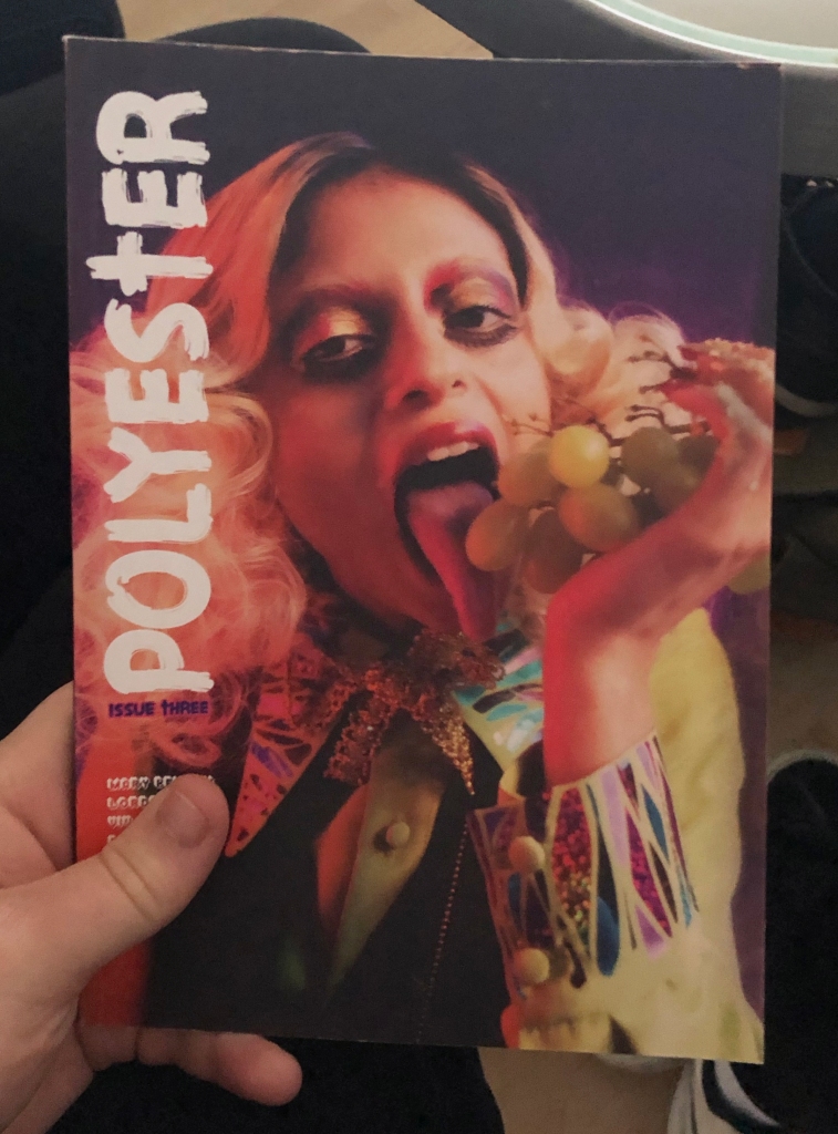
We had a lecture and workshop with one of the members of the Polyester magazine. She told us that around 30 people per issue working on it regularly. They need every help to make the professional edits and prints. Their zines are really high quality and it takes 3-6months to produce a single issue. As normal as it sounds, they use InDesign to make templates for the zines and then print it from there. She suggested a prinitng company that they use to print themselves which is the “Premier print group ‘. Overall, I learnt a lot about the distribution of zines and magazines which will come helpful in the future when I would like to publish a magazine. Polyster: Celebrating all things trash, kitsch and camp, Polyester is a London-based zine exploring feminism and gender identity through fashion.
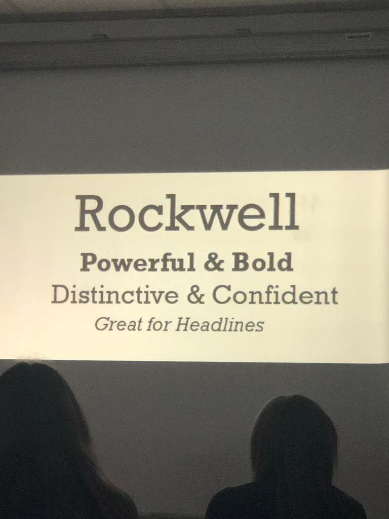
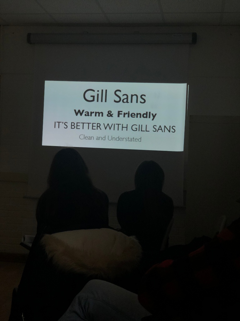
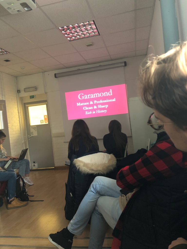
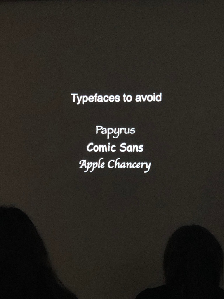
Lecture on fonts

Readability:

Text is for reading, so making my text legible Tiny/ Giant font sizes, crammed line height, or ugly and difficult to read fonts make the viewer’s experience of my book much tougher to understand and read.

 Leading:

Leading, or the space between the lines of text, is an invaluable tool for readable text. Bad leading can ruin a good piece of copy, and good leading can make even the worst type up look readable for anyone. For large blocks of text, 1.5 times the size of text is a good size. Smaller text should have tighter leading, and a huge text should have a lot of it. 

Colour: 

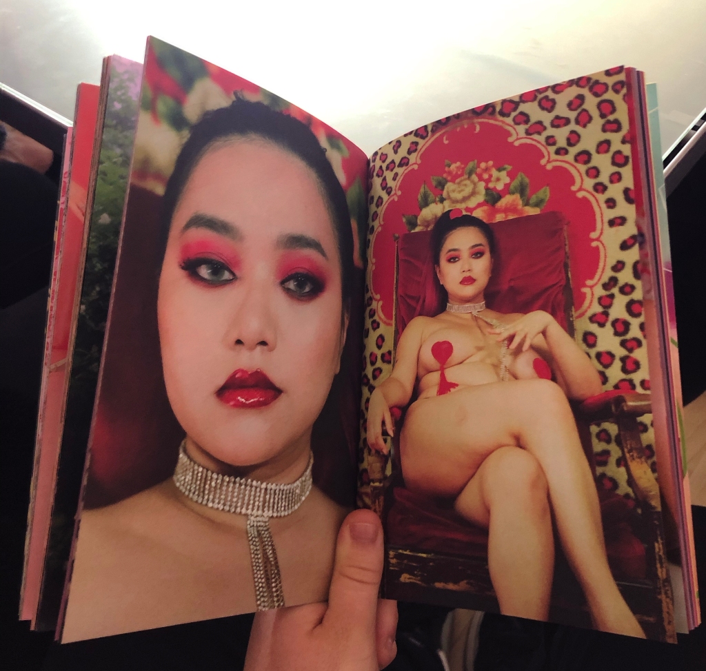
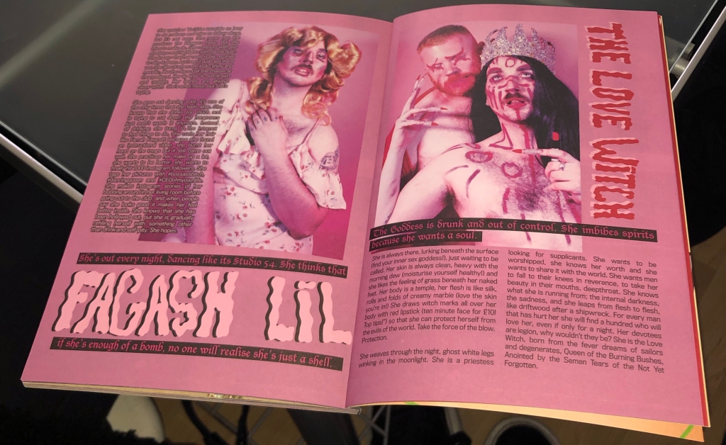
I have to be cautious with colour, the contrast between the text and background is significant. I have to choose a combination that will be readable. Black on white backdrops are a standard, Yellow on pink would have been too bright and it would be hard to read. Colour may also be used in a photobook to reflect aspects of photographic work. 

Popularity on fonts:

Helvetica, widely seen as the most popular 20th Century font only started to grow its fame in the late 20th Century when it was distributed on Apple Mac computer and was more an appreciation of the 20th Century modernism. 

Editing:

I learnt I shouldn’t be afraid to cut, then edit and see how it looks, also I got to make drafts and copies and re read so I give my best in the final results. 

Workshop: Lighting ( Studio and External)

ST - Workshop

This workshop was amazing, I had so much interest into lighting. John, which was our teacher, taught us many tips and directions of using more lights that I didn’t know about yet. 

For instance, I learnt about the “Kino flo” where it has a nice dimmer attached to it to control the shadows. This type is best known for developing proprietary LEDs based on a colour science technology that ensures colour quality unsurpassed for lighting both close-ups and on large studio spaces. 

Next I learnt about the “Broncolor pocket wizard” which is very handy for studio photography. It is simply a radio wave instrument that allows the flash in the light activate itself when you press the shutter. Now we have ones using Wi-Fi or Bluetooth whereas ages ago they were used by cables which was a big hazard as you could trip over and hurt yourself. 

Another device we learnt about was the majestic “BronControl” where I was able to adjust the lighting with my smartphone, tablet or computers.

We used a very professional lighting device called the “Broncolor Siros” that contained 800J (Joules) which is the measurement of speed, in this case the light. The Siros is a moonlight that we used in the studio. With flash durations from 1/8000 s (t 0.1) or 1/13’000 s (t 0.5) and recycling times from 0.02s you can capture every moment perfectly. Radio synchronisation uses either Broncolor RFS 2.1 or Pocket Wizard. The enormous control range goes up to 9 f-stops, resulting in output as low as 2 joules which gives the photographer an unrestricted choice of aperture. And the lightning-quick charging time, 0.02 to 0.90 s at 400 joules, means you never have to wait.

Workshop: Installation and set Design

ST - Workshop

In this set design workshop, I learnt a lot of health and safety information while building and installing a set in the studio. Below I will show some photos I have from the workshop; we had an instruction working in the design technology department explaining different ways of building a set. Using the drill, we had to be especially careful as it’s a dangerous tool, we had to have goggles on if there was a high risk and aprons so our clothes wouldn’t get dirty.

Here are the health and satety cautions we learnt about:

 Only people that need to be in the studio should be there.

In a studio environment the common major risks are:

Slips, trips and falls caused by people falling over equipment.

Issues concerning the use of electrical equipment.

Identified hazards and actions that can be taken to minimize the risks:

Sharps – The use of scissors and utility knives are often required to cut cable ties, gaffer tape. When these are not in use, they should be stored safely with blade covers on in a place where they will not be accidently knocked.

Suspended equipment – ensure all suspended equipment is securely fastened and where necessary with secondary safety chains to stop items falling e.g. suspended studio lights, heavy backdrops.

Above head height working -Equipment or stored items that requires above head height working or, access to these items to be made by appropriate step ladders, kick-stools or scaffolding as necessary. The access to comply with agreed safe working practices e.g. Step ladders requires someone to hold and stabilise the ladders all the time someone is using the ladders.

Risks of Trips Slips and Falls

Keep the studio clean, clear and un-cluttered. –  All the equipment in the studio is to be stored in the correct and safe way when it is not in use. Items to be stored in designated areas around the sides or outside of the studio, no equipment or empty boxes are to be left in walkways or places that people could trip over items.

Make sure all unused equipment is put away before you start your shot to minimise the equipment that could get in the way. Make sure all bags, boxes and equipment trunks are moved to a safe area at the side of the room so there are no trip hazards.

After the shot put all the equipment that needs to be put back away is safely stored.

No food and drink – are to be taken into the studio. This is to prevent food or drink being split destroying or damaging the equipment, giving electric shocks from the wires. Also, food or drink on the floor could be a slip hazard. There is a possibility that photographic chemicals might be in the studio, if so, they could contaminate food and drinks.

Tripods and Light stands – Make sure all of the legs on tripods and light stands are pulled opened to give the greatest stability.  This reduces the risk of equipment toppling over on top of someone or damaging the equipment.

Electrical Equipment Risks

Trailing wires and leads – All wires to be taped down or run through rubber cable floor trunking protector. This is to stop people tripping over the wires and hurting themselves. Also, to prevent damage and ware to the cables that will shorten the cables life.

When plugging and unplugging electrical equipment switch of both the equipment and the plug socket before putting the plug in.

Check all the electrical equipment is up to date with PAT testing. A visual check to be carried to ensure there are no exposed wires, damaged leads, plugs are firmly pushed into sockets, no cables are stretched, and the equipment looks to be in good condition and works as designed.

Lamps – Never touch lighting bulbs, even when cold. Incandescent lights work at high temperatures. If handled the finger marks and traces left behind can cause localised hot spots that will cause a bulb to blow, or even explode.

Workshop: Book Binding

ST - Workshop

This workshop came in very handy when it will come for me to be making my own book myself, I learnt many stitching techniques and actually practicing them on physical books. Making a book from the start or I’ll say from scratch was amazing because I felt so proud to say I made it and not the publisher. For this project I am willing to do a photobook as my final outcome. We all in the workshop learnt the 3-hole Pamphlet and the original Kettle stitching techniques. 

This equipment was used to get the stitching done: 

  1. Book knife
  2. Book binding needles
  3. A bone folder made out of Teflon
  4. A book binding thread

3 Hole Pamphlet Stitch:

  1. Fold the paper equally in A5 (that was the size we were working with).
  2. begin by putting a hole in the middle, top and bottom, and that can be done by using the needle.
  3. Sew the thread through the eye of the needle, go through all the wholes, then pull the opposite end and a knot will be formed so the thread will not come out of the eye.
  4. Push the thread through the middle hole from the front inwards and then the top back again.
  5. Finish by tying a double knot and the book would be bind with the 3 whole Pamphlet.
Pamphlet Stitch

Kettle Stitch:

Materials used:

  1. Book knife
  2. Book binding needles
  3. A bone folder made out of Teflon
  4. A book binding thread

“A knot formed in the sewing thread at the ends of the sections to hold them together.”

  1. Start by folding an A5 paper in half to create an A6 size, which will follow to a grouping together in fours.
  2. Create a template using an A5 piece of paper with a tab which shows you where the top of the A6 paper will measure.
  3. Make sure to take the right measurements from the tab which indicates the length of the A6, create five holes, one which will indicate the middle, one top and bottom a cm away from end, and then one in between each and the middle.
  4. Follow those steps by making 5 holes using this template on the A6 booklet of x4 pieces of paper. Put the smooth edge of the papers the same way in all the booklets to create one smooth side.
  5. Layer all booklets in front, to have a clear look, with binds facing away apart from one which will face towards us.
  6. Starting from the hole on the left, thread carefully the needle and tie a knot. Continue through each hole until the end of the process.
Canadian Bookbinders and Book Artists Guild - Home Study

Workshop: Photoshop Re – Touching

ST - Workshop

I really enjoyed this workshop as I feel really confident with postproduction such as using the photoshop software. Here I will present two photos, one which is the original and the next one is after editing. There is one little thing that is different to when I normally edit. I used the Wacom digital editing tablet. At first it was difficult as I never had my hands on a piece of technology like that. I first had to change the settings before doing any adjustments. You can adjust the sensitivity and buttons on preferences. 

Soft is very sensitive and firm is the opposite: 

A screen shot of a computer

Description automatically generated

You can adjust what area you want your pen to work in, this allows you to only focus on specific areas such as the eyes or lips. 

A picture containing indoor, refrigerator, monitor, computer

Description automatically generated

The getting into the actual retouching we used the High and low frequency re touching technique. 

High frequency is about the details and the texture of the photograph such as the skin. Whereas the low frequency is about colours, so the cold or warm tones and shadows. 

I firstly Duplicated the layer to have a background layer and name it colours and texture.

After I made these adjustments: Texture- add Gaussian Blur, Colour- image- apply imagine.

A picture containing monitor, indoor, microwave, screen

Description automatically generated

These affects made my image look like this, a mask looking feature:

A flat screen television

Description automatically generated

Lastly, go to linear light and take the colour and texture layer and group them together. This this made the mask come off and made me carry on with editing such as removing imperfections, adding tones, using the burn and dodge tools to lighten and darken features such as teeth and eyebrows. Using the liquify tool I improved her facial features such as her jawline, her lips to make them pop more, made her eyes slightly bigger and adjusted her cheeks to make her even prettier in my opinion. 

In extension, I learnt how to make my photograph in photoshop be printed in the A3 size. 

Add border 

Image

Canvas size

Clock Relative

Choose you centimetres 

Press okay 

Then go to layer

Flatten to make it white

A picture containing indoor, sitting, monitor, front

Description automatically generated

Here I present my Before and after: