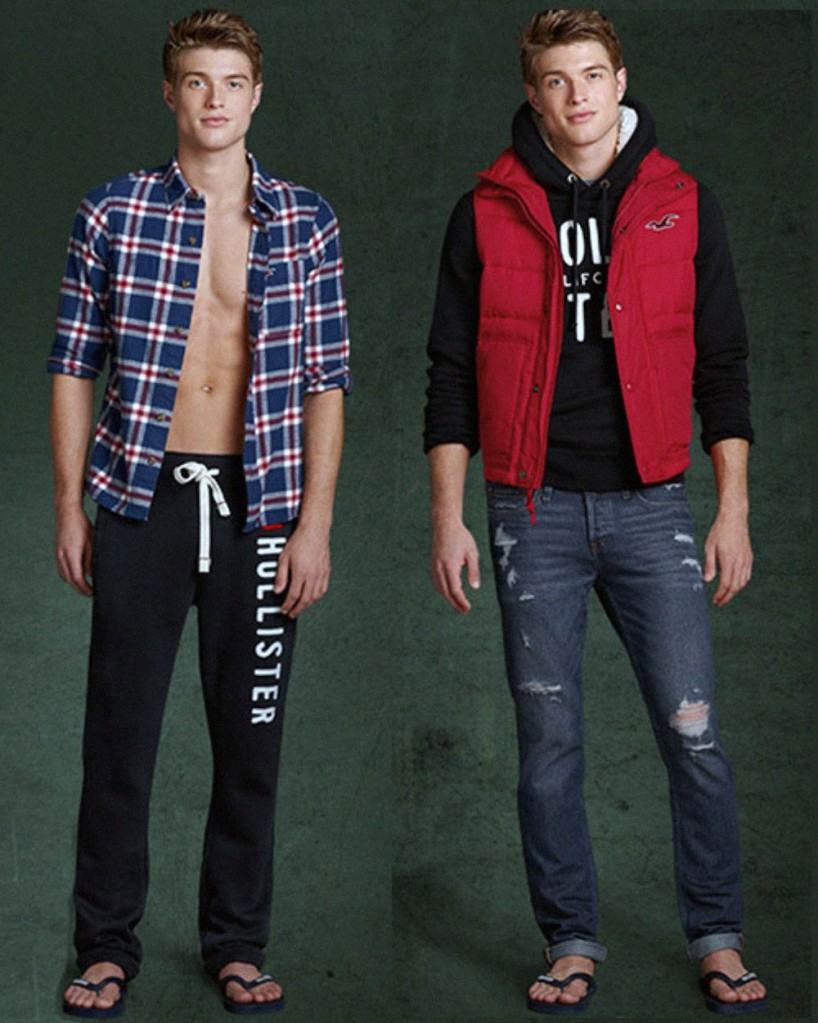
1990-1999
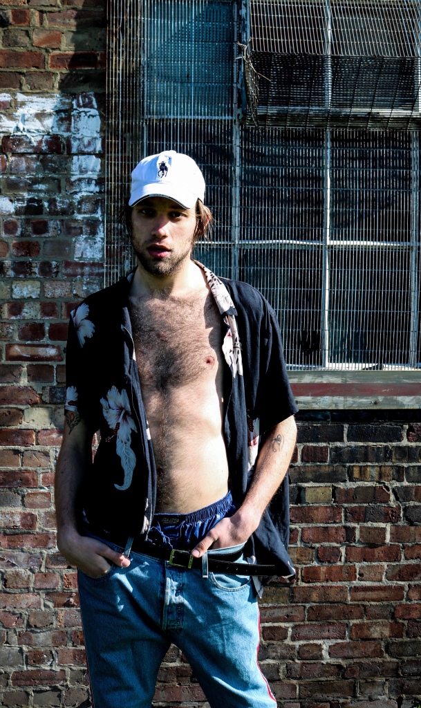
The 1990s experienced a huge fashion transformation as men basically banished any trends from the ’60s, ’70s, and ’80s in attempt to redefine themselves. “Casual” was the only style that stayed, and minimalism was the new thing onwards. Mainstream fashion styles were influenced by three significant youth subcultures of the decade: rave, hip-hop, and grunge. T-shirts, shorts, jeans, trainers, sweatshirts, hoodies, tattoos, piercings, and prominently displayed brands comprised the majority of any man’s closet. In fact, the shift towards a more casual work uniform began thanks to the ’90s and its rejection of stuffiness and formality. By the ’90s, however, an era of casual, relaxed clothing in simpler colours and cuts replaced that influence. Leather jackets, knit sweaters, flannel button-downs, bowling-inspired button-downs, baggy denim jeans, overalls and baseball caps.
2000-2010
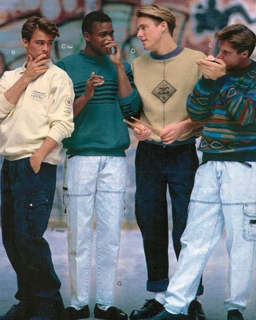
The early 2000s saw the climb of fast fashion. With globalization, and the ability to cut costs through outsourcing, brands such as H&M and Forever 21 were able to mimic runway looks at a fraction of the cost. This resulted in the collapse of class structures defined by fashion. High and low trends were mixed, and as clothing became cheap, everyone was able to save up for designer accessories. At the turn of the millennium, men’s fashion experienced a brief “futuristic” wave. Black, silver, and metallic were in. Men wore leather outfits, puffy jackets, tracksuits, and Rockport boots.
In the mid-2000s, distressed denim became popular, along with military wear as everyday clothes. Popular colours included beige, rust, and forest green, and men wore low-rise jeans, light-coloured polos, cargo pants, khakis, and short sleeved button-downs. Accessories such as white belts, aviators, trucker hats, flip-flops, Argyle print, and oxford shoes were also in fashion. Suits became slimmer, and popular styles included black, navy, charcoal, and pinstripes. Nehru suits and Mandarin collars, inspired by James Bond and the Matrix, began to emerge.
Youth fashion was inspired by hip-hop and skater culture, mixing sportswear with high fashion. Sneakers, from Chuck Taylors to Nike Air Jordan’s, became hot items. At the same time, goth and indie pop subcultures developed. People became interested in vintage thrift store shopping and adopting a darker, rocker aesthetic–a twist on British mod. The favourite trend of mid 2010 were mainly Converse sneakers.
2010 – 2015
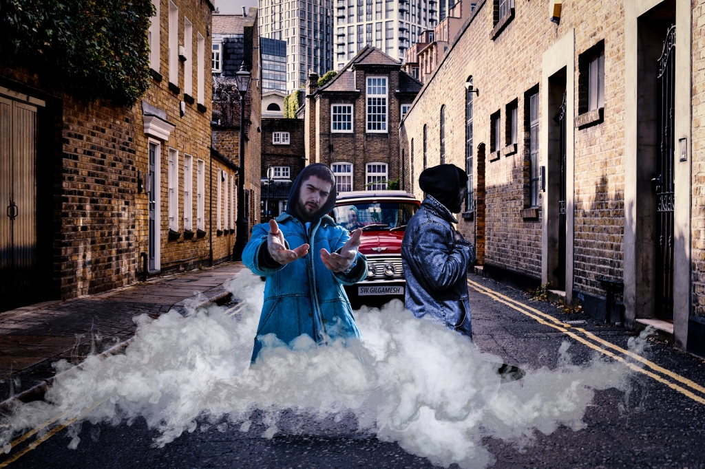
Smart casual looks, athleisure, along with hipster fashions were on trend. Fashion designers began to move away from the slim fitting casual attire and frequently combined business casual pieces with sportswear. Brown replaced black as the most popular colour for leather jackets, and common accessories included orange hoodies, black track pants, faded jeans covered in iron-on patches, black or white leather hi-tops, Timberland boots,(became popular again just like in 2014 and 2015), navy blue wool coach jackets, graphic print tees featuring a small statement design dark flannel sportscoats, cambric shackets, or camouflage jackets layered over cardigans or Alpine patterned sweaters and white Adidas sneakers.
2015 – 2020
2016:
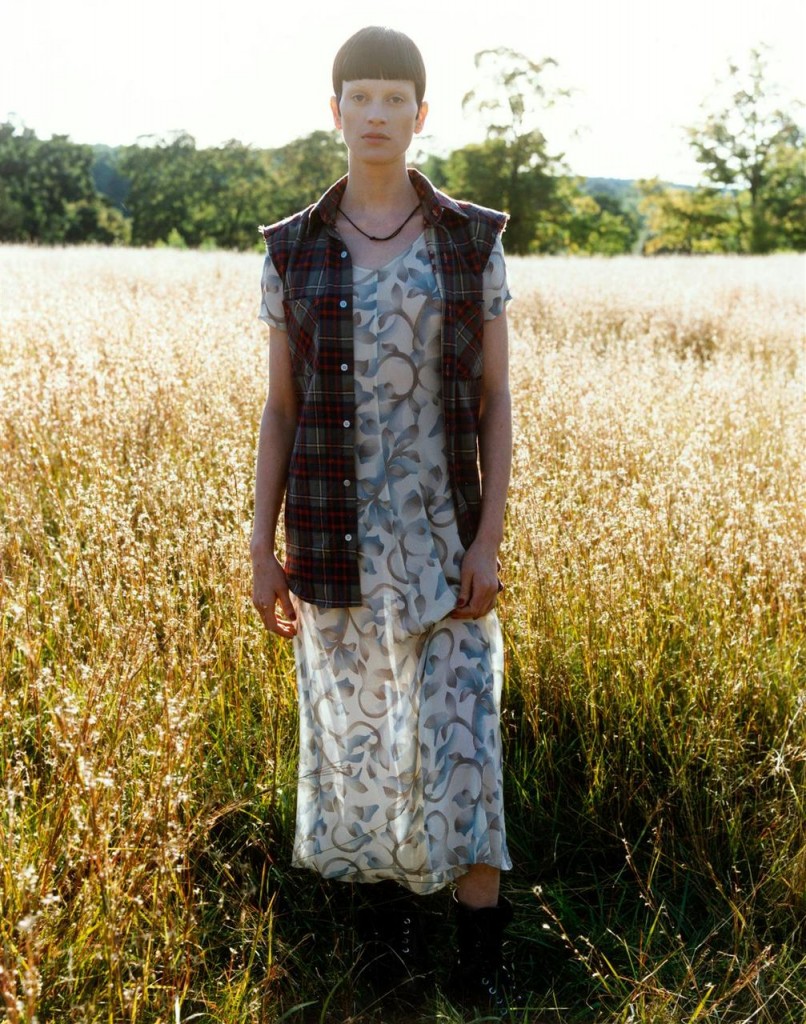
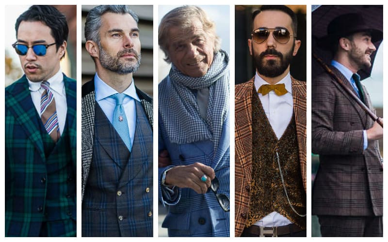
Tartan
Reminiscent of private school uniforms, tartan emerges yet again as a popular pattern choice in recent street style looks, featured most prominently in the form of bold suits featuring this classic design. While tartans in traditional colours work well to maintain a classic feel to looks, experimenting with bolder and brighter versions for a more vivid take on the trend. Reds, mustards and bright greens are a few examples of more daring tartan colour choices that will leave an impression. A bright tartan blazer worked nicely as a focal point for outfits, People accessorised accordingly with minimal pieces that will sustain a youthful silhouette.
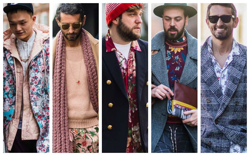
Floral Print
Recently popularised in shirts and jackets, the floral print is found in its varying degrees of brightness and boldness in many street styles looks. While the trend can be a little overwhelming for most men, florals can work well to lend more dimension to your looks. It also brings the sunnier feel of spring/summer aesthetics to wintery looks for added brightness in the chillier months. Incorporate slim ties in vivid floral prints to brighten up suits or a floral pocket square for a simple take on the trend.
2017:
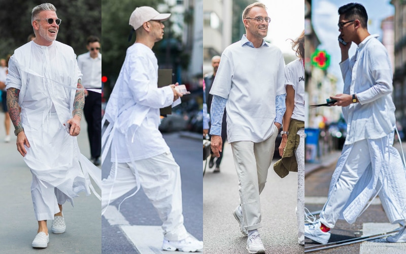
All white
Head to toe white prevailed as a favoured street style trend that was certainly bold. While most gentlemen that harnessed this trend went for more elaborate oriental-inspired silhouettes, there are simpler ways to channel elements of this trend for your weekend wear. White jeans with a humble white t-shirt but throw on a navy or emerald baseball cap for a more grounded look. Roll up your jeans for a relaxed adaptation of the trend. Throw on some dark sunglasses to bring a bit more dimension to the plainness of all white.
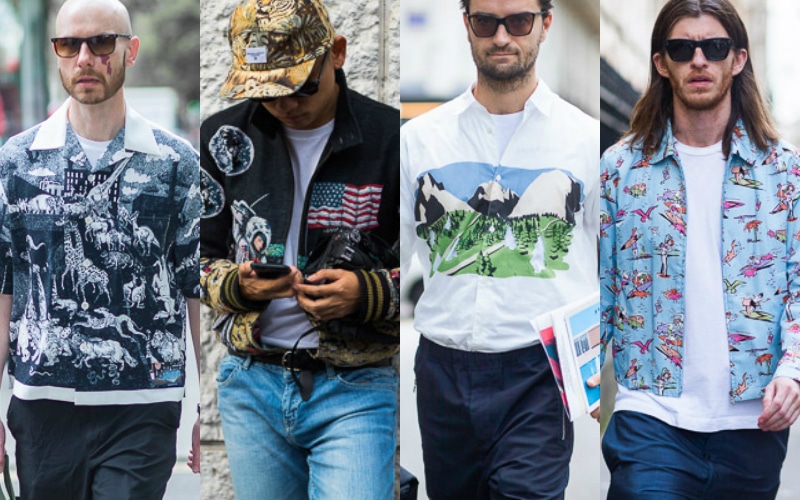
Childhood memories
A more playful trend that emerged from the European streets during fashion week was the novel childhood references that were emblazoned on shirts, jackets and baseball caps. Gents saw this fashion as an opportunity to play off youthful imagery. Astronauts, spacecrafts, zoo animals, surfboards, and the like were the fun style statements with references from our younger years. To incorporate this trend in their everyday wear, they went with male accessories for a simple boost to the simplest of casual pieces.
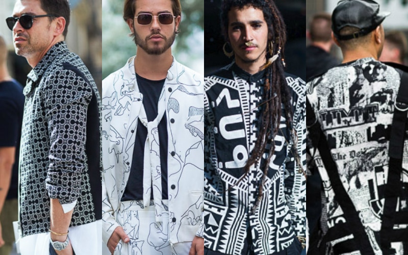
Monochrome Prints
On the topic of childhood memories, the monochrome prints featured on the European streets of fashion week were a little reminder to our memories of ‘101 Dalmatians’. Bold, graphic and unusual, Fashion Week attendees weren’t afraid to make daring statements in the most humble and basic of all the colour combinations. For men who are not as brave, incorporate black and white in more traditional patterns, like bold stripes or ginghams which will read more classic yet perpetually stylish.
2018:
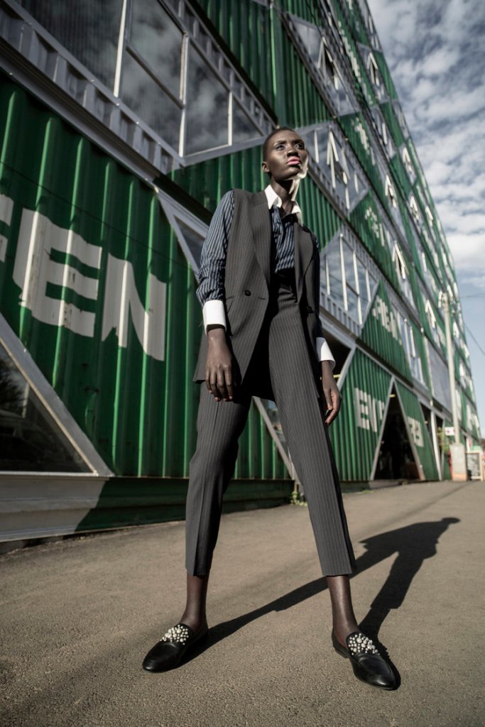
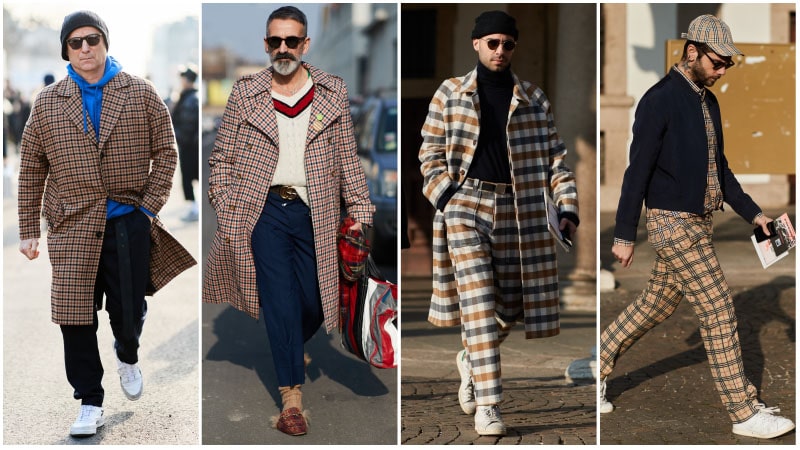
Vintage Checks
During the closing of 2017, vintage checks were trending heavily for women. Coming into 2018, they have also been adopted by the gents and are now appearing on everything from men’s trousers to jackets and even caps. To rock this look, men started out with one statement checked garment, such as a coat or blazer. Then, while feeling confident, consider adding a matching piece, like pants or a hat or bag.
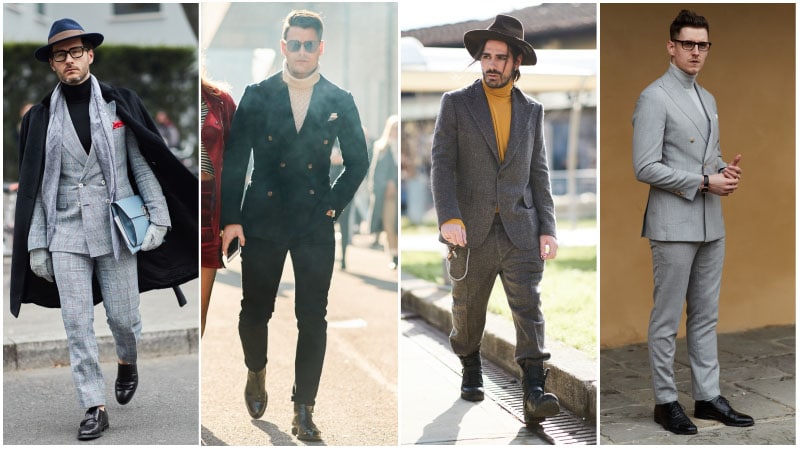
Turtleneck Suits
Suiting never went out of style for men, but there are ways to keep your tailored look appearing on-trend each season. This year, it’s all about what men paired with their suit. So, when the weather gets cold, they swapped their usual shirt for a turtleneck sweater. By combining a turtleneck with a smart suit, you’ll be able to achieve an incredibly stylish and sleek look. This was used to wear in the office, dinners and other semi-formal events.
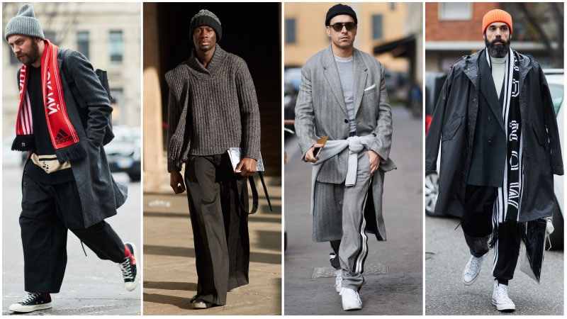
Oversized Silhouettes
Last year garments became looser and larger than they were the previous years. In 2018, that trend is set to continue with oversized silhouettes dominating casualwear. To rock this look the right way, remember that it’s all about striking the correct balance. As you don’t want to appear sloppy or as if you don’t know your size, it’s essential to ensure your oversized look is suitably smart. To do so, men went for high-quality fabrics and sophisticated styles that have merely had their proportions blown up.
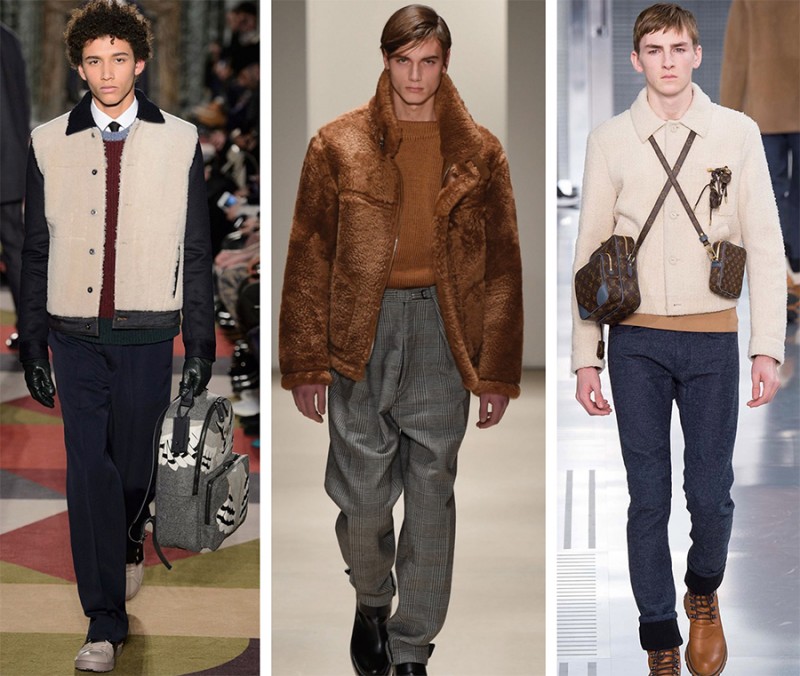
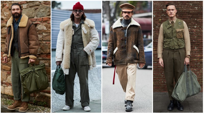
Military Men
It may not be new, but military wear was back for another round in the world of men’s fashion in 2018. The trend, which includes practical pieces and utilitarian designs, blends both function and style into one. To wear it in 2018, sticking to pieces in shades of beige, brown, army green and khaki. When it comes to designs, gents looked for army-style garments with simple fastenings and large pockets. Then, completed the look with a shearling-lined aviator jacket.
2019:
Large Leather Clutch Bags
Gents have begun embracing bags more and more. With the size of phones and the number of cards we all have these days, sometimes pockets just didn’t cut it. To safely and stylishly carry their essentials this season: a large leather clutch or pouch. Not only can these bags tote everything you need for an outing, but they also look great doing it. In fact, their simple yet sleek style even makes them the ideal bag to pair with a suit.
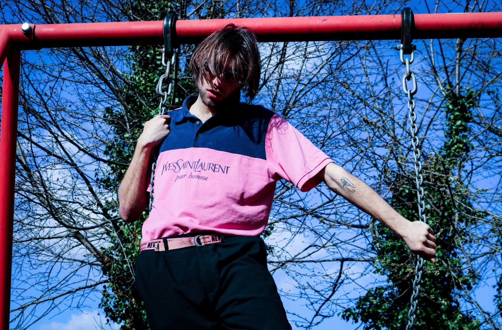
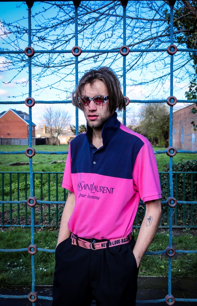
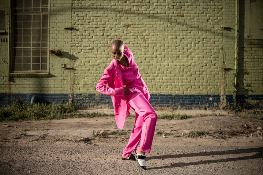
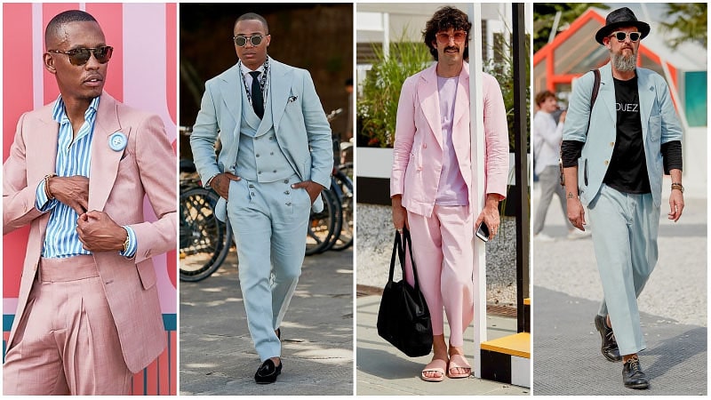
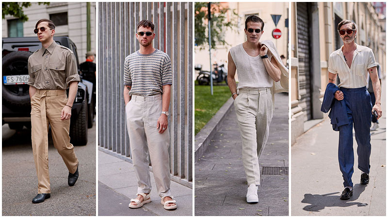
Pastel Colour Palettes
While beige was a favourite colour in 2019, it wasn’t the only standout hue. Pastel colour palettes also made their mark at the menswear tradeshow. Colours like light pink and sky blue were spotted in the form of suits and tops, adding a stylishly soft touch to masculine silhouettes. These looks, which appeared light and bright in the summer sun, projected a resort vibe and proved an excellent option for elegant, modern men.
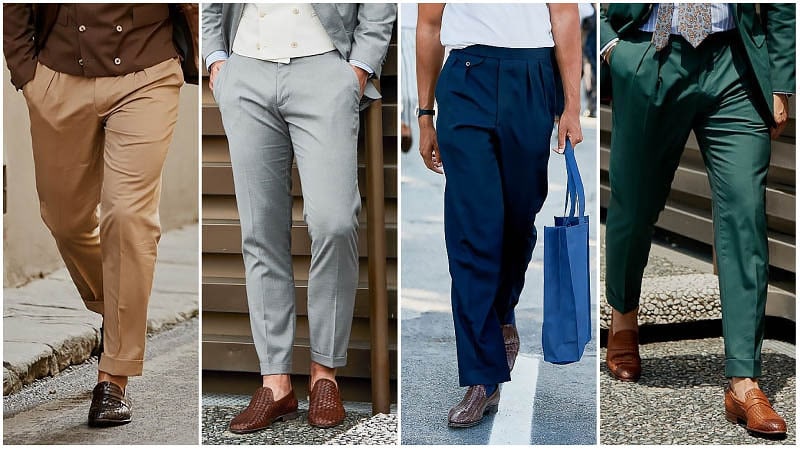
Woven Brown Leather Loafers
Men fell in love more with brown leather loafers. Paired with suits and smart trousers, these shoes provided the perfect finishing touch to a range of ensembles. Gentlemen contrasted a pair with a linen suit for an easy-going yet elegant appearance. Unlike traditional loafers, the woven design added an eye-catching, textural element to your outfit.
2020 (present)
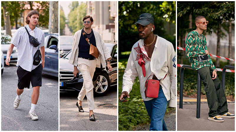
Cross-Body Bags
Keeping your belongings safe and sound with a super stylish crossbody bag, whether it be a messenger-style or something small and neat, these are a great way to secure your stuff and do it fashionably. If the strap is too long for your liking, tie a small knot in it, and you’ll have a unique addition to your collection. This is a great way to jazz up an outfit and is a practical way to do it.
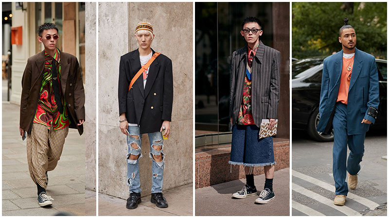
Oversized Blazers
Take it back to the ‘80s with an oversized blazer. Large and in charge, put a twist on the essential suit jacket by taking it up a few sizes. Whether it be a pinstripe or something one colour, this is a great way to put a retro spin on a modern outfit without looking too formal. Choose a fit that’s slightly bigger than the regular fit or go all out with something massive. Pair it with a basic T-shirt or a funky button-down and jeans, and you’re going to be strutting down ever.
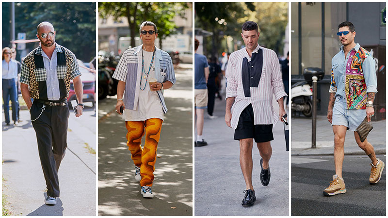
Patchwork Prints
Make it loud and wear it proud – patchwork prints are back. From Versace- esque designs to plaid, this is something that looks great on everyone. Wear a shirt with cut outs of different styles and contrasting colours with a white T-shirt to make the whole outfit pop. Stand out even more with funky pants or keep the top half the hero by pairing it with dark trousers for a classic street style.
High Waisted Trousers
Take it back to the ’40s with high waisted trousers. This is a flattering style that comes back into fashion every few years, due to its versatility. Channel your inner trousers by pairing them with a tucked-in T-shirt or put a modern twist on the traditional pants by rocking them with an open shirt. From navy to cream, this is a great bottom half to wear all year round.
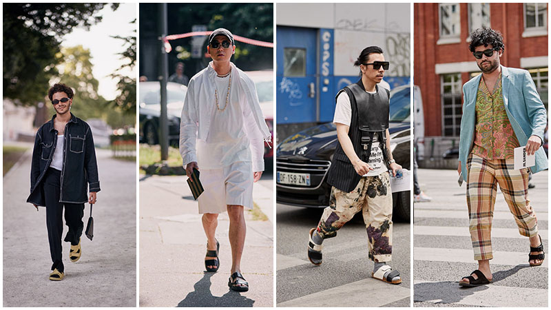
Two-Strap Slides
Make the world your runway with these two-strap slides. Unlike traditional footwear, these shoes offer double support and look extra cool as you walk down the street. Choose from branded shoes or something low-key, and pair them with jeans, suit pants or a pair of flared trousers.
Conclusion
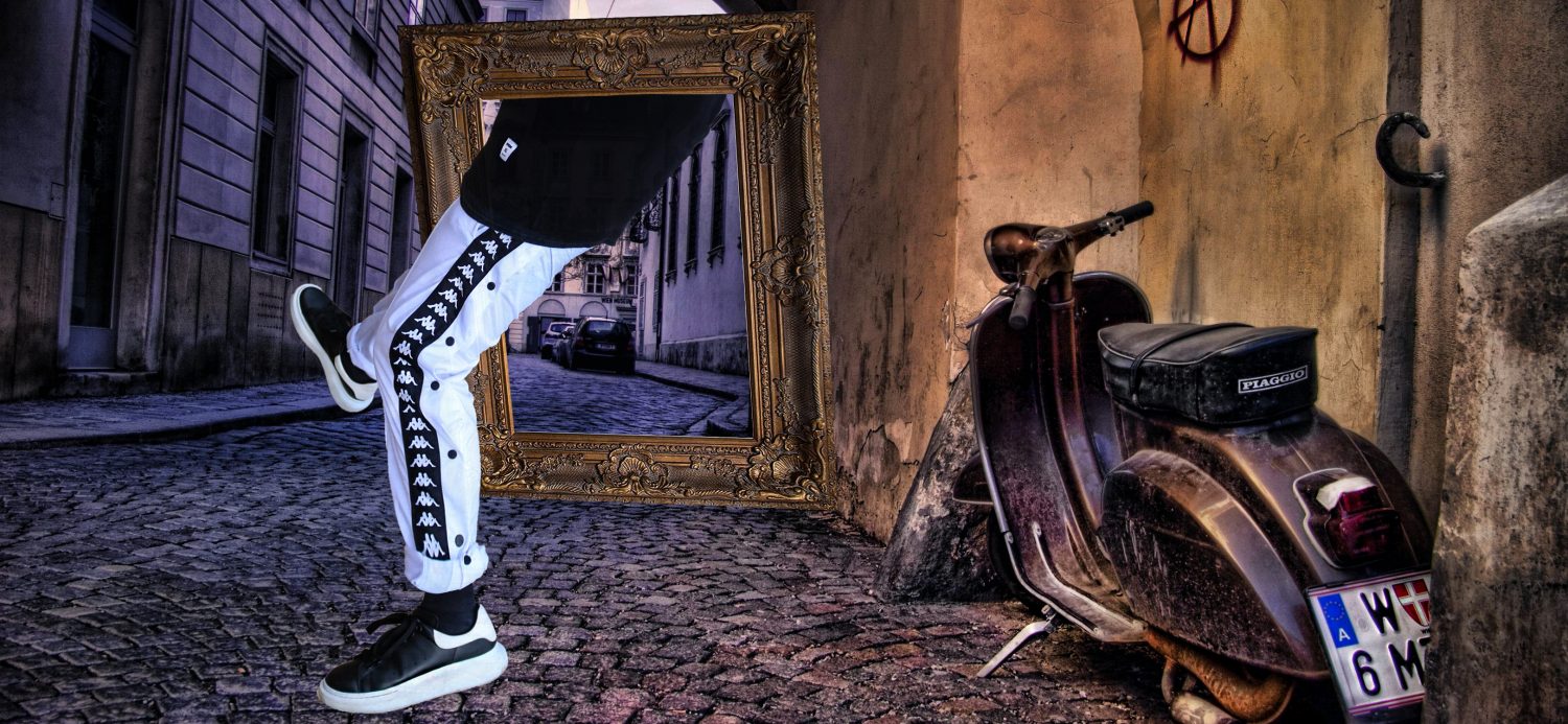
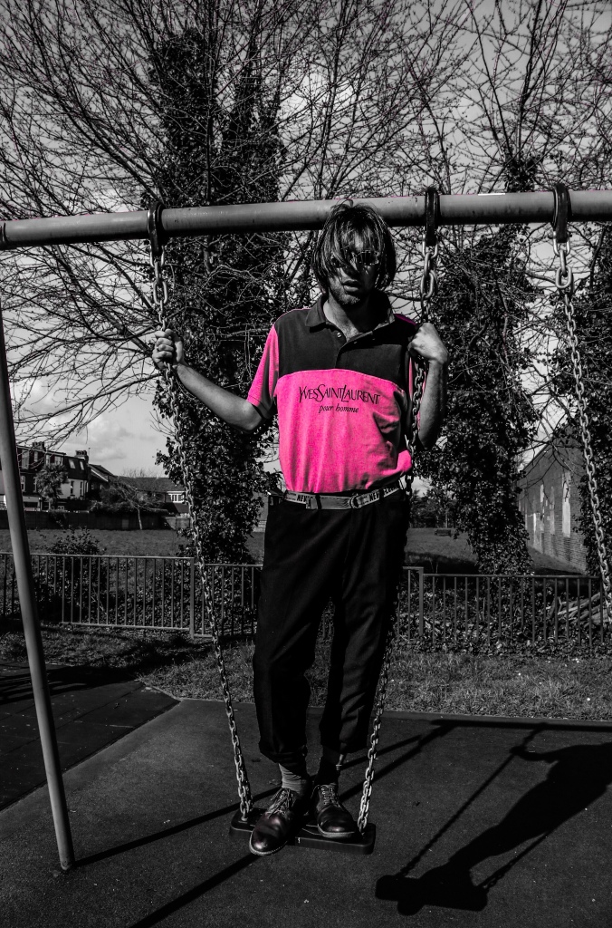
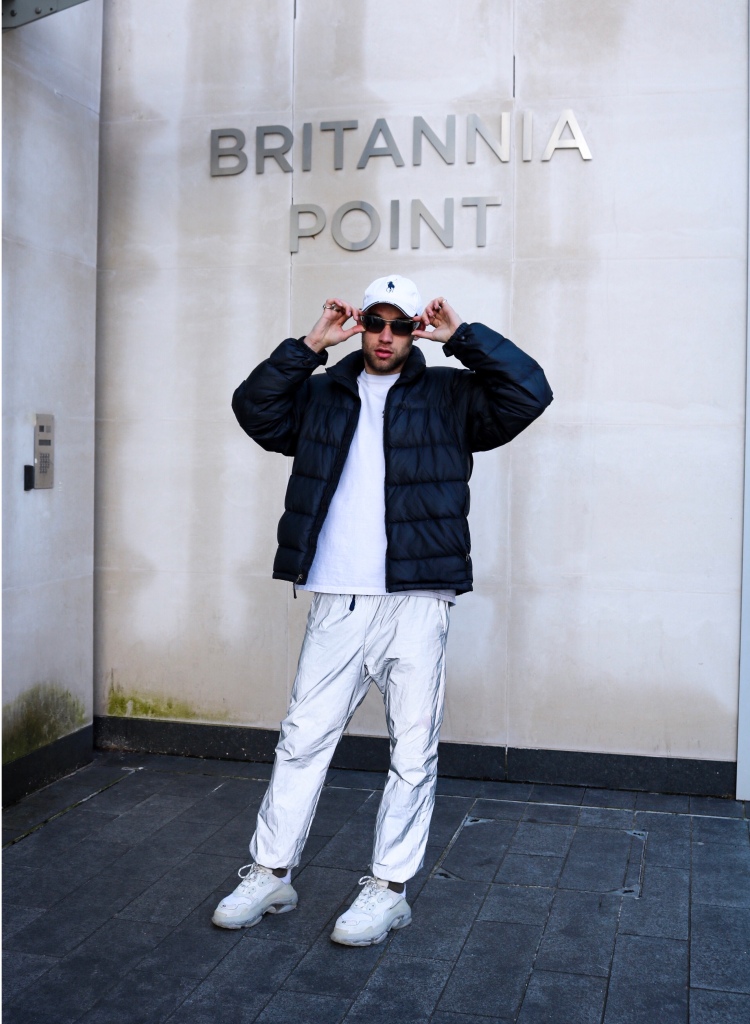
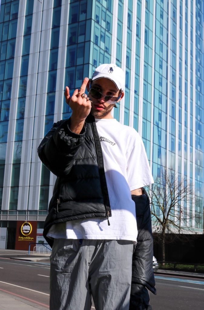
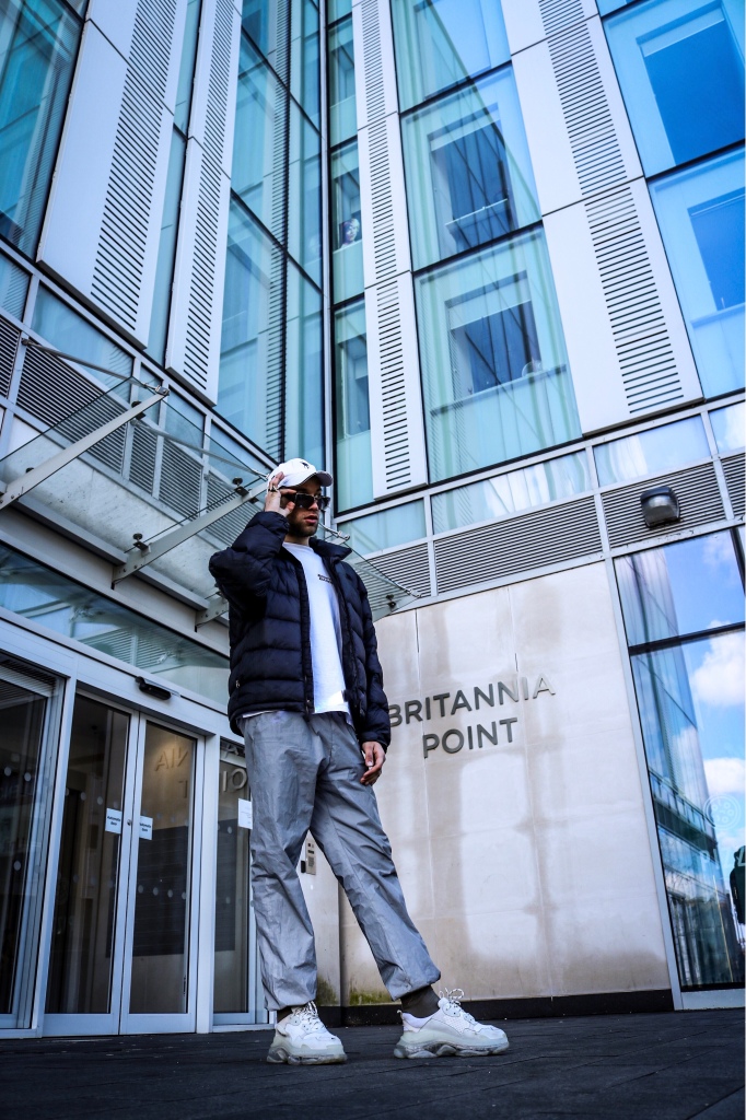
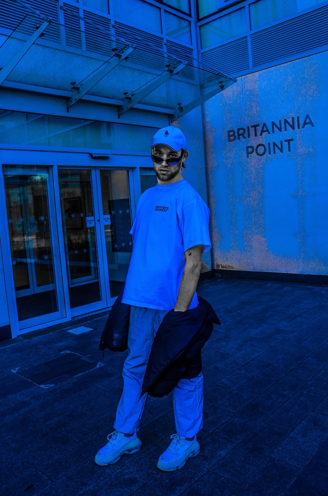
Overall, the trends clearly have changed throughout the years but for men it was not new clothes or new accessories, in my opinion it was more adjustments or size changing. Bigger clothes, patches, bags, vintage themes and suits were changing from year to year. I have a smart and high beast style where I like to be comfortable with what I wear but look like I have class. I now adore wearing oversized tops, suit pants, tucked in t-shirt or hoodie, “dad shoes” ( Gucci Rhytton) and fill it in with some minimalistic accessories such as either two rings, a bracelet and one chain that I wear since I was young.