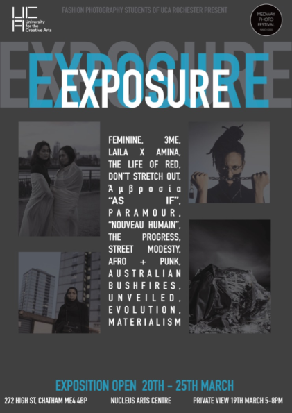
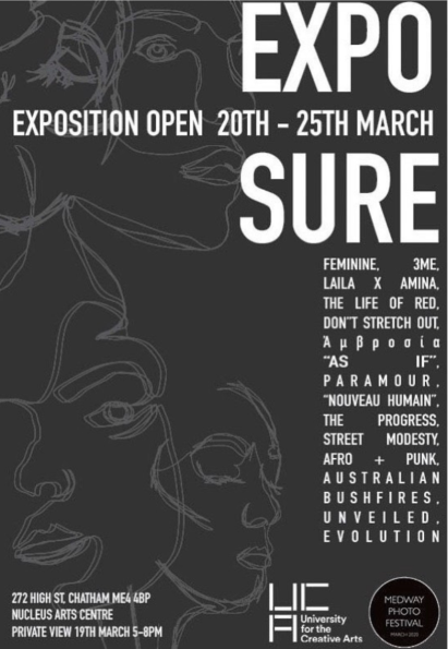
Here I want to illustrate the finished poster designs we had to promote our Exhibition. Some people had them hanged around our university campus, so students and teachers were aware of the time, content and visuals of our work. I was pleased with how they came out overall, they do tend to stand out by being clean, crisp and informative as much as they could. The dull background on both posters were done that way so the white text could stand out, was easily read and allowed us to not make it a very busy poster as we wanted to include some of the photos on the first poster. This allowed the viewers to visually see what they could expect from our work and the poster also included all of our fashion photography project titles; my one is “Evolution”.
The information we included on one or the other were projects titles, opening times, the address of the location which was the Nucleus Art Centre, date and time, photos, artwork, our university’s logo and the logo for the website. Without this information, the poster wouldn’t be as informative and wouldn’t allow the viewers to see everything they needed before attending.
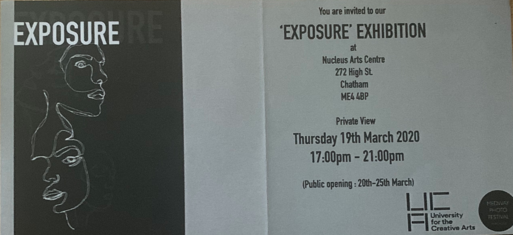
Invitation
A simpler design was used to create physical invitations that were printed on paper and were to be given out to the public, our friends, families and anyone interested. They actually were printed exact to the number that we had the number of people attending from our guest lists. Here is an example of the invitation itself.


