Major Project Proposal

Major Project proposal

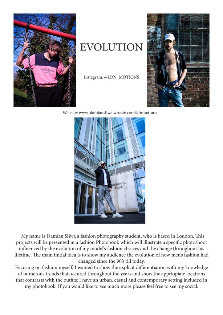
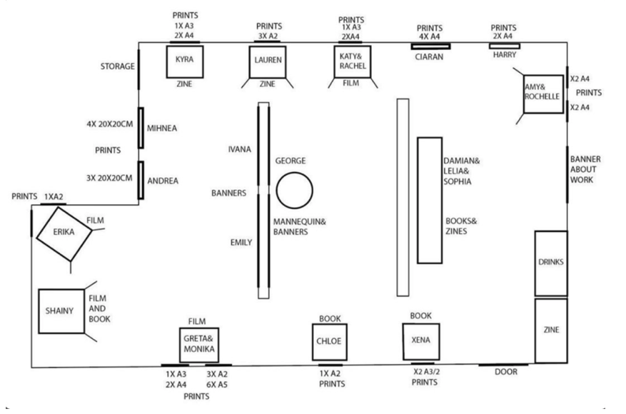
Recently I have been looking through my photography and was seeing what was missing to complete my dream of becoming a fashion photographer. In this project proposal I would like to explore about surrealism and its aspects in fashion photography. This could change within the next semester however I know for a fact I want to further my knowledge on using photoshop, lightroom and InDesign to create surreal photography. As of layout, I believe it will be best to produce big A1/A0 prints to show my photography on a large scale. Our university has the great advantage of having a printing lab and therefore it would be necessary for me to use it while I’m still studying there and create something phenomenal. 

Making large format prints will allow me to get use to publishing my work on a bigger scale for future exhibitions or to have them sold as photograph prints. Furthermore, this projects proposal will definitely connect with my dissertation proposal as I would be exploring surrealism in fashion photography. 

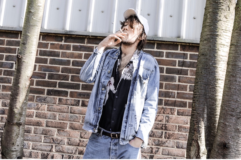
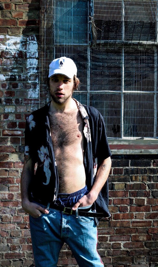
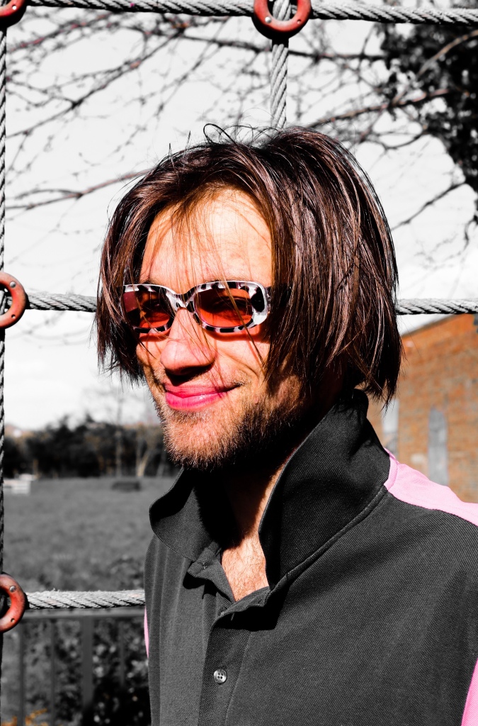
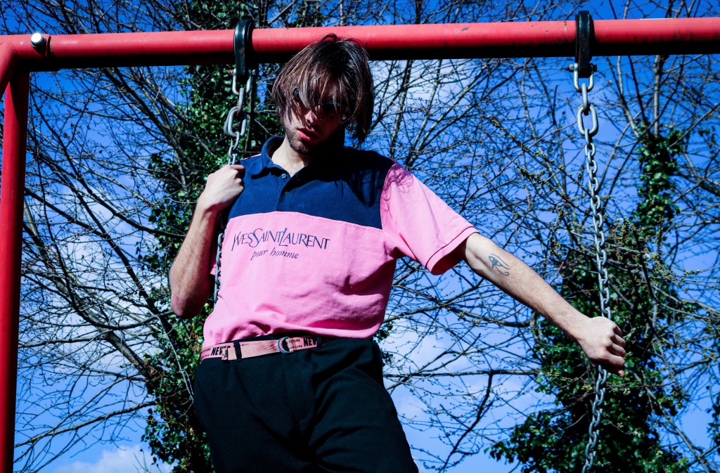
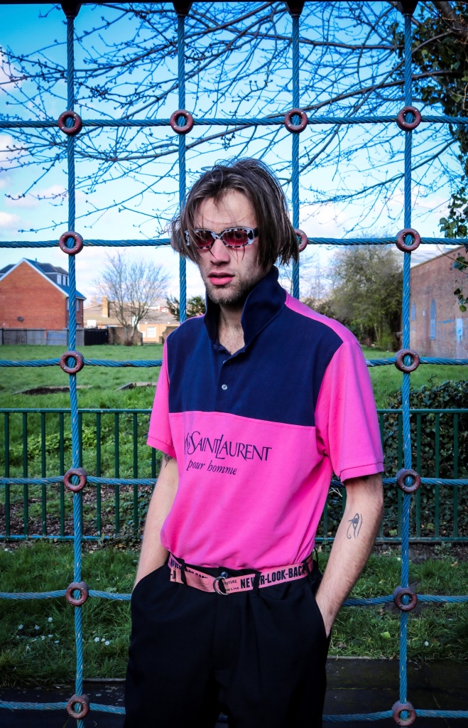
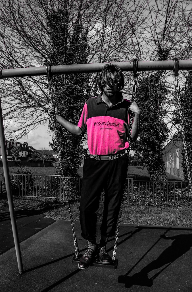
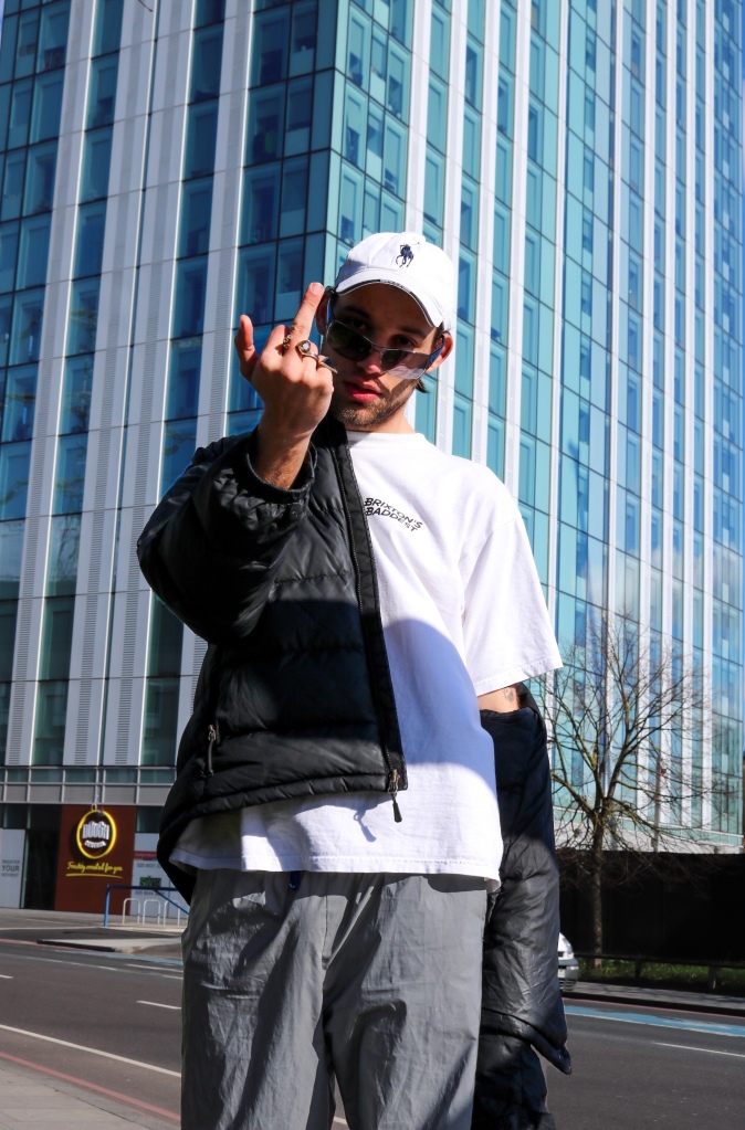
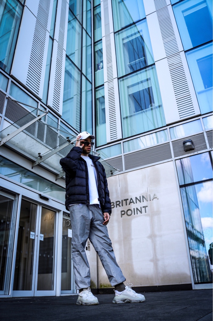
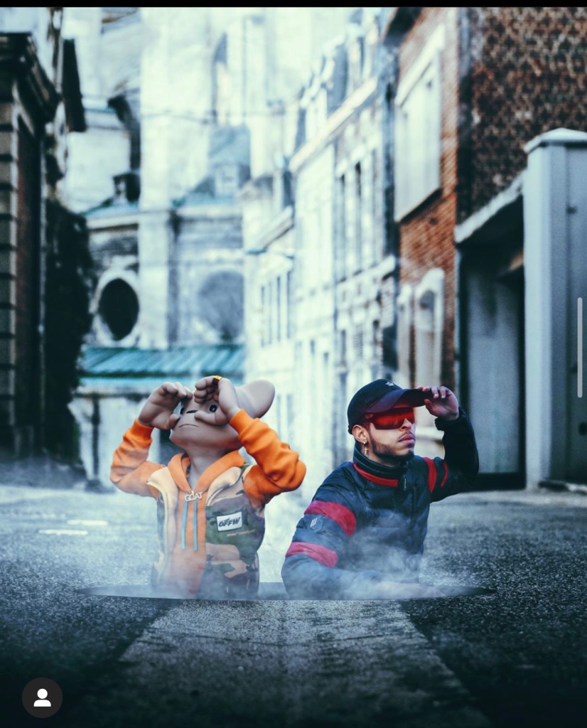
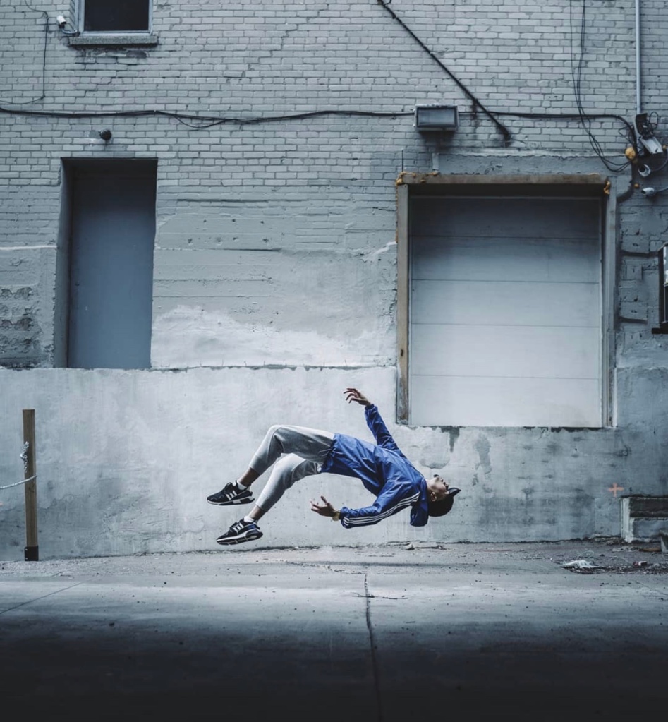
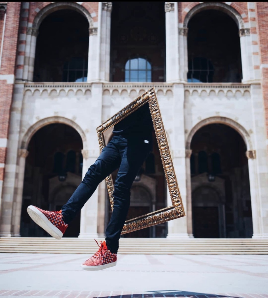
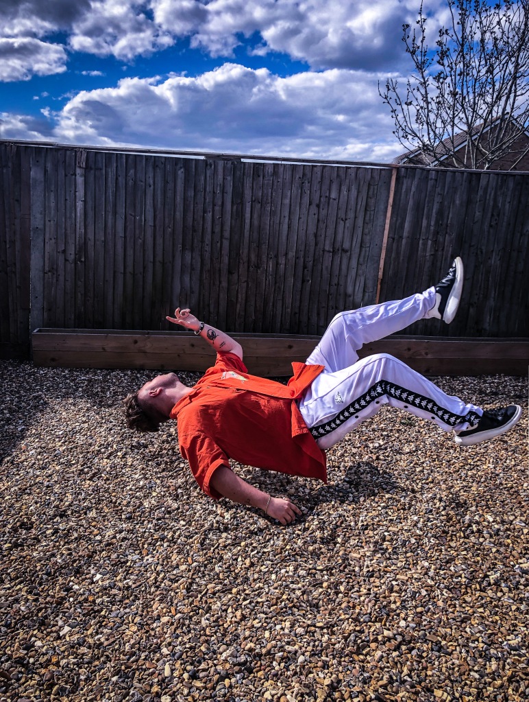
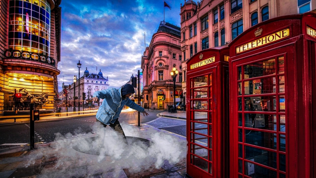
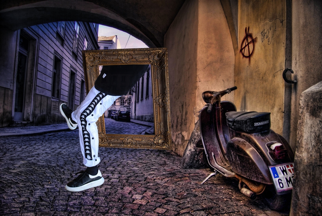
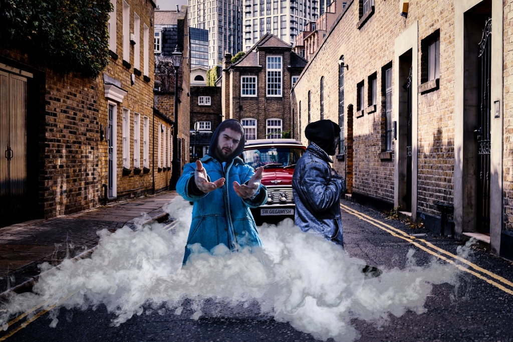
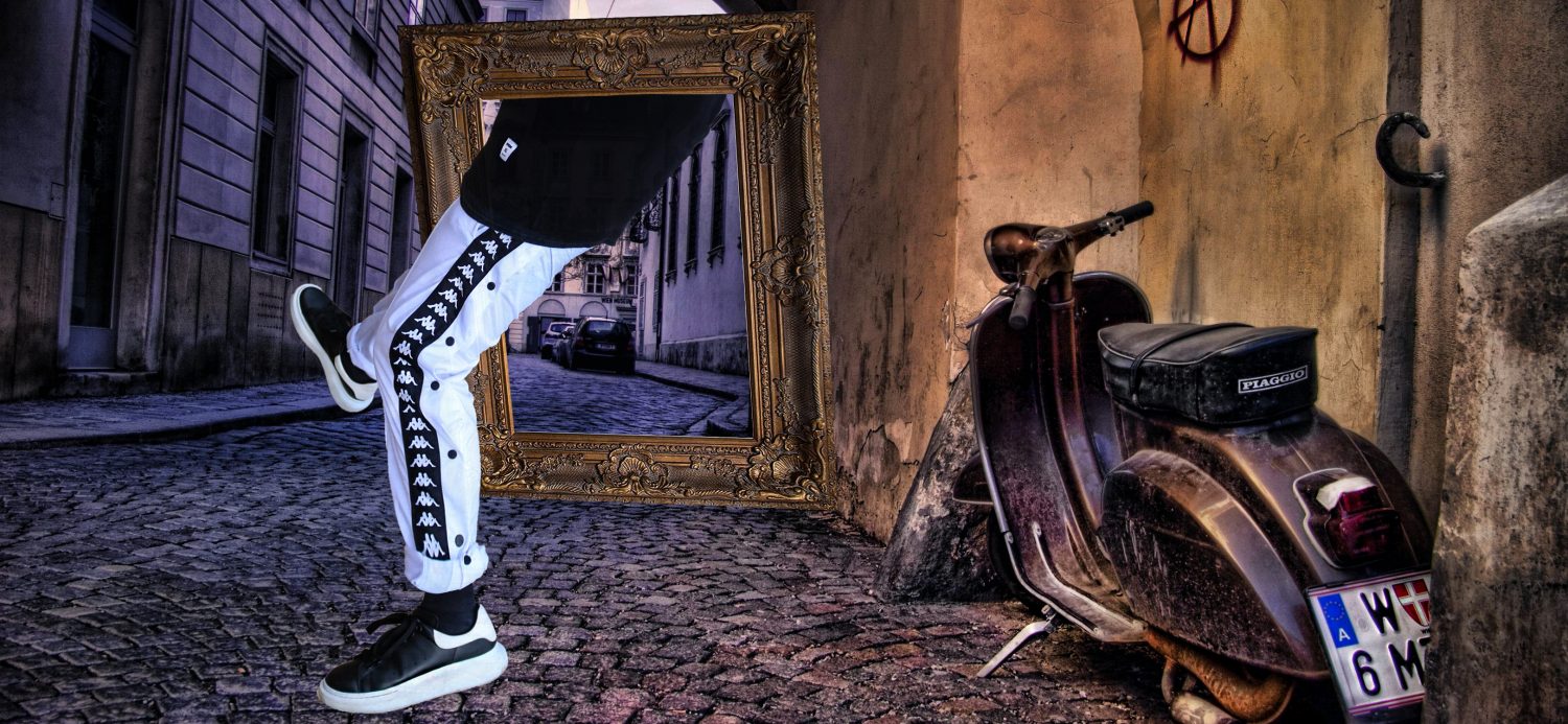
I have always been interested into surrealism, since the early stages in high school, I wanted to do something different, something unique, something that catches the viewers eye instantly. My future photography will include a storyline within photo series. There are many photographers, artists and authors who can relate to surrealism and its power. I want to research and analyse the way our subconscious mind processes memories, artwork and mind tricks on a daily basis. The phenomenal book ‘The interpretation of dreams’ by Freud, S. and Robertson, R. (1999) I found some initial starting points in dream symbolism for instance boxes represent the fear of something being unseen from or keeping a secret from others; Teeth can be a sign of nerve-wracking about appearance. Hair is a representation of looking to fix some personal relationships or to embrace one’s sexuality. By including ambiguous prompts and accessories within my shoot it aids my concept. Moreover, I would like to shoot my major project in our studio on campus because it will give me a range of lighting such as gel lights or rings lights that could come useful to play with juxtapositions and compositions in the work space and as I am very familiar with it and feel comfortable working on set. Now it is a great time to search for very photogenic and stylish models that I could use, the sooner I find them, the sooner I can study their work, their postures and how they look on camera overall.  

Surrealism has been hugely influencing the fashion industry since its breakthrough. Surreal Chic at Valentino’s 2010 catwalk had projected surreal film montages on to the backdrop of the catwalk. Alexander McQueen has dressed women n feathers, shells and butterflies. His 1997 show ‘La Poupee’ was directly dedicated to photographer Hans Bellmer. McQueen explored notions of manipulations of the body on his runway, shown in his accessorising his model with a cage like contraption. What I find interesting about surrealism is the idea to reveal a story within photographs that allows the audience to feel an emotion and can create their own story or experience a view into another person dreams. 

An artist that I find particular interesting is Tim Walkers fashion photography. His work is very imaginary based, in his Alice and wonderland work and Babes in the wood, the surreal overtones are cosmic. His images can expose and create memories, that show a fairy tale world associating with Irving Penn’s observation that ‘Fashion photography is about selling dreams and not clothes’ Penn is someone I will for sure be looking forward looking into and reading about his ideas to further understand fashion and the beauty of it. Lastly as stated before, I would like to construct a series of photographs that show this magical photo manipulation and make an interesting series of large-scale prints to showcase them framed. This will really get my photography noticed from far and maybe even seek opportunities from the public. 

Bibliography:

  1. Freud, S. and Robertson, R. (1999). The interpretation of dreams. Oxford: Oxford University Press.
  2. Baudot, F. (2002). Fashion & surrealism. Paris: Editions Assouline. 
  3. Gordon, I. (2004). Theories of visual perception. Hove: Psychology Press. Taylor & Francis Group.
  4. Walker, T., 2020. Tim Walker on The Inspiration Behind His Darkest, Most Surreal Photographs. [online] British Vogue. Available at: <https://www.vogue.co.uk/arts-and-lifestyle/article/tim-walker-shoot-for-the-moon-photography-book&gt; [Accessed 10 September 2019].
  5. Martin, R., 1987. Fashion and Surrealism. London: Thames and Hudson.

Group Work

Team Work and exhibition visit

To begin with, we as a course were split into three groups: Exhibition design, Promotion and marketing and Install and takedown logistics. I as shown above was parted into the installing and taking down group, as the actual event was cancelled me and my group was not able to do much during this process as it didn’t happen so all the labour work such as taking plinths, painting, measuring, considering small details, organising, gathering equipment and visiting the gallery beforehand couldn’t be done much. We managed to attend workshops and group meetings to do with the exhibition to discuss the process. Other teams had just as significant job role as my group, the design team organised the layouts which was mainly figuring out where our work was being displayed, the promotion team had an important role to share the word that this exhibition was happening by making websites, Instagram pages, initiations, posters and making sure everyone was getting involved in the development of the event. 

Install and Takedown process   

Below you can see a photo of one of our meetings we had to discuss our work and plan our exhibition further, I am sitting next to our teacher and was clearly writing some ideas down. 

From the layout post I posted before, you can clearly see that some work was needed to be hanged, us as a team had to think of a way to made them float in a professional and easy to access manner. We as a group visited the Nuclear Art Centre not too long before our event to have a clear idea of what we were working with, where the sockets were being placed, how much space does everyone physically have in which the work could not be close to each other but each individual work was meant to stand out for itself. We found this helpful as for one It was an important task we had to undertake in our group and for two we imaged what our exhibition would have looked like in the following weeks. From the visit I noticed that we didn’t have a lot of work to work with, the room was indeed divided but there was not much space for everyone to have multiple submission as it wouldn’t have been too complex and busy for our visitors to focus. Luckily as seen below the Centre have provided us with tiny hooks and binder clips that could have been used to hang people work with ease and it assured other students that they were safe to display their work how they imagined. 

As videos, photobooks and zines were not to be hanged on the wall, we had to find an alternative that would also be easy to access, look simply interesting and attractive. To fulfil this, we manged to go to a different department to find plinths and tables. We overall needed three tables and eight plinths to bring into the show space, Shainy included her own plinth she already had and customized. Moreover, we found a large plinth in a size of three normal ones that could be used to showcase the zines, they are found on the bottom left corner of the layout map. Some of the students wanted their plinths to be repainted in a certain colour such as black but most were going to be repainted white. Due to the virus and the event being cancelled we unfortunately had to also cancel a dedicated day to painting which was frustrating as I would have enjoyed making a new look for the stands. Furthermore, nobody had to bring their work to our campus as the event was postponed, we individually had to do our own research from home since then as we entered a lockdown stage where we all had to stay at home and self-isolate. Here Ill present some of the plinths we were going to use at our show:

Lastly, because of Covid-19 we clearly didn’t have an opportunity to install and take down our exhibition and display photos in this post to document it, on the other hand we were fairly prepared for it if it was going to happen, there was even thoughts of having a virtual exhibition online but not many people were much interested. I am sure our event would have been appreciated, came out successful and opened opportunities to students for future events like this and show them how much work is needed to be done to make it happen, me, other teams and our teachers worked really hard for this to happen and due to horrid circumstances, we only managed to plan and promote the event. 

Below is an Example of a Virtual Exhibition Amy has created to showcase our work and with the design team they could imagine where everyones work was being displayed.

Group main roles in a slide by Rochelle.

Exhibition has been Cancelled

exhibition cancelled

Unluckily, with all of our hard work, will power and excitement, the exhibition was announced to be cancelled due to the spread of an infectious virus, Covid-19. As the virus is contagious and was still fresh at the time, having a bunch of people in an airtight space was not great as anyone was at risk of the highly dangerous virus. With all our hope, we had to formally apologise on our Instagram page that the event was not happening anymore. By having bold, red and capital text stating “CANELLED” above our poster it took peoples interest and guided them to read about the reason the gallery and us didn’t allow the event to be displayed. The worse thing was that it was a couple of days before opening and I am sure that if it did happen, we for one would have had amazing feedback, we would of experienced our first ever exhibition as photographers and would allow us to promote each other on social media, local community and the overall public which could of influenced our careers. Below is a screenshot of the announcement from the Art Centre itself talking about its recent activity.

Initial Exhibtion Statement

My Initial statement

Each contestant was asked to create a brief statement in around 100 words to have an opportunity to say who they were, what they were showcasing, examples of work, title and I also included my Instagram and personal website page link. This statement was published under the name of the student on the online website and on the zine. As the statement was targeted at the audience, we each wrote them in first person which I found really professional due to the fact that I am being more and more familiar of having my work shown and published. 

Below is what my finished initial statement looks like. 

Exhibition online Website

Exhibition Website

What is an event without an actual website? We came out with a fully working website for our exhibition which included artists from Photography as well as Fashion Photography. Normal photography students were meant to have their exhibition first and Fashion photography were going just after. Using the free platform “Wix” the creator was manged to make this website work and be accessible to the public, the link could have been entered through our Instagram page in case anyone wanted further understanding of our event. Individuals work could have been also accessed from the drop down menu on the website with information about the photographer and a brief statement of their work that we were going to showcase. 

Here is a link to our website: https://jdee61.wixsite.com/medwayfest

Layout of our exhibition

Exhibition Layout

While making progress without exhibition the design team came up with a layout setting for our event. It explicitly shows a plan of the exhibition from a bird’s eye view, all the contestants names were shown where their work was being presented, it displayed where books and zines were placed, and banners for our show. As submitting a book along with Leila and Sophia we had a table to ourselves which wade it easily accessible to the public to view our books. Furthermore, we were actually very limited with time and the physical space because the room was not as big as we would love it to be however the design was made to visualise each personal space correctly and precisely. As my team was instillation team, I was meant to be at the place early to set up all the pillars, tables, prints, zines, drinks and any other adjustments that had to be made. Overall I was very excited about the exhibition, its content and the publics live reaction to our work.   

The Exhibition’s Instagram Page

Exhibition Instagram page

To further promote our outstanding and hardworking event, the promotion team came up with a clean Instagram page. Why social media? Most people, especially students go through Instagram and see what is happening in the world, with the magic of it, we were able to promote our exhibition with photo examples of our photography and artwork. The Instagram page was great to have an interaction with the public, gain thought and criticisms from our audience and well sadly also was made to show the cancellation of the vent itself.

Here is what our logo, bio and our recent following status is:

Below you can briefly see how our clean Instagram was presented, it looked professional, amazing, stunning and vibrant. We didn’t want to give out too much information so therefore mainly people from the promoting team uploaded their examples on the page to be seen by the public. 

Here you can see an example of a post from our Instagram page, it included their initial statement, their name and their favourite piece of photography they had from this project. Overall, I was pleased how this came out as we were able to reach to many people and it allowed us to see who was interested into our show

Posters for our Exhibition

Exhibition Posters

Here I want to illustrate the finished poster designs we had to promote our Exhibition. Some people had them hanged around our university campus, so students and teachers were aware of the time, content and visuals of our work. I was pleased with how they came out overall, they do tend to stand out by being clean, crisp and informative as much as they could. The dull background on both posters were done that way so the white text could stand out, was easily read and allowed us to not make it a very busy poster as we wanted to include some of the photos on the first poster. This allowed the viewers to visually see what they could expect from our work and the poster also included all of our fashion photography project titles; my one is “Evolution”.

The information we included on one or the other were projects titles, opening times, the address of the location which was the Nucleus Art Centre, date and time, photos, artwork, our university’s logo and the logo for the website. Without this information, the poster wouldn’t be as informative and wouldn’t allow the viewers to see everything they needed before attending. 

Invitation

A simpler design was used to create physical invitations that were printed on paper and were to be given out to the public, our friends, families and anyone interested. They actually were printed exact to the number that we had the number of people attending from our guest lists. Here is an example of the invitation itself.  

Evaluation

ST - EVALUATION & FINAL PHOTOSHOOT

The “storytelling” project was one of the greatest assignment that I have experienced. I have learnt a lot about photography and fashion since the 1980s till today which expanded my knowledge on the difference in style that occurred during those years. This time I have done something that I have never done before and that is designing and producing an actual photo-book. I was challenging but since it was a storytelling unit, I have decided to fit the best outcome to its theme, when I think of stories I think of book; my photobook didn’t require any text apart from the context page as in my opinion the photography speaks for its self. The photo sequence runs in a chronological order which explained more explicitly is the era from the 1990’s till today. 

My model was quite perfect to choose as his story of changing styles fitted well in this project. He went from not knowing any fashion brands since he was younger to now where he is passionate about the choice of clothes he buys and wears now. That for me was enough of a backstory to create a whole photo-book about. 

As I didn’t work in the studio but in a field, playground and the street it allowed me to have natural lighting, genuine wind effects in the hair and props that were not needed to be bought in. Taking photos with my DSKR Canon 750D was great as the quality came out amazing to be printed in a book and post production was great as I started with RAW files from scratch. The physical book was created in Snappy Snaps as I trust them with my work, they are known very well and have never been to regret their work. I had all my photos on my card, I asked for a photobook template so I could design and create the chronological order of how my photos will be set to be printed. The overall process took around two days for me to come back and see the outcome. The first look at it amazed me and inspired me to make much more books like that even to have as a portfolio for my future career. 

(90’s PHOTOS)

The 90’s themed photoshoot came out outstanding, I used some props to further make it obvious for the era I chose, my model needed direction as he isn’t used to modelling much however with my help, we manged to get what I wanted. For the postproduction I used photoshop to retouch his skins and Adobe lightroom for the lighting process. With photoshop I managed to get rid of imperfections, smoothen, sharpen and crop the photographs to the perfect standard and quality. Using Lightroom allowed me to add cool, green and vibrant colours to make my subject stand out. My Favourite shot was a portrait of my model with a lighter and cigarette as it really gave me that vintage vibe of when smoking was considered cool back in that time. I used selective colour spotting to get rid of the saturation and pop the fire in which the main colour in the photo was yellow. Overall great positions, compositions and styling came out appropriate for that theme.  

(Mid 2000 PHOTOS)

Let’s take it back a couple years back to around 2006-2010 where this photoshoot was themed at. That was the time of Popped up collars on polo shirts, messy or side parted hair, the time of introducing suit pants to be more casual and funky sunglasses. I tried and I think successfully achieved to include all those elements into my second photoshoot. I styled my model into an YvesSaintLaurent polo t-shirt, contrasting pink belt, relaxed suit trousers, funky pink and leopard print sunglasses and formal shoes. The final shots consist of different perspectives and compositions, such as close up headshot, all body shot, close up of torso, and mid shot portrait which worked well in the photobook. Overall, I managed to recreate a scenery from the mid 2000 which fitted well in the evolution of men’s fashion. 

(2020 PHOTOS)

Now it is all about the name of the brand and having it flashy and big. I didn’t focus on a formal look in this contemporary theme style, however focused on more of a hype beast (streetwear) style. I styled my model in Balenciaga Triple S sneakers which are very demanding and trending, reflective trousers that you see a lot on Instagram because of its amazing feature of having them monochrome in daylight and very bright and reflective with flash. The top part includes a skating brand simple white t-shirt that my model supports, a black puffer North face jacket, Givenchy sunglasses and a Polo ralph Lauren baseball cap. I believe I made this shoot standout with the branding and made it obvious that I aimed at the recent fashion style which could be easily compared to my previous photoshoots. 

Lastly, I want to conclude that I have faced difficulties with the choice of Location, one way I could improve was to have a variety of location choices to experiment with the styles. One thing in my opinion I performed well was the overall concept of portraying my project with its aim and goal to have a significant and explicit story of different styles since the 90’s. 

Artist Research: Irving Dee

ST - Artists, ST - Research

This artist was special to me this year, I found him on Instagram, his photography wowed me differently. His photoshop skills stood out to me with illusions such as floating theme photos. I tried to respond to his photography and made my own versions during quarantine. This relates to this project as it’s a new story with my own photography using this style that I fell in love with.

 This French artist is also my age, so we share the same generation which further inspires me to create fantastic photography similar to his style. He might not be a professional photographer, but he is for sure an artist I look forward to now when he posts on Instagram. He stated in an interview “I dislike doing things that other people have already done. With that said, sometimes it’s fun to do it. I try to avoid repetition as much as possible. It’s a constant struggle for anyone”. This makes me want to do more unique photography that I can take towards the upcoming academic year and into the future. 

He started when he was only 17. He had an obsession with faces and the surreal style, he used to do a lot of trick photography, making people levitate, ghosting clothes, Irving only got into shooting the city a lot later when he joined Instagram to further experiment with his techniques and style. 

Finally I want to say that he inspired me to make content to show people a false concept and sense of reality, he stays on trend and stays consistent which I look forward to be doing in my own future and career. below I will show my response to his style using photography.