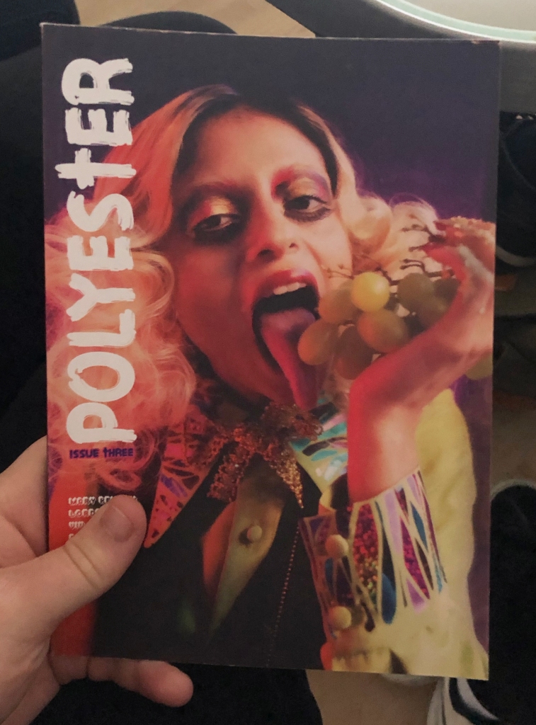
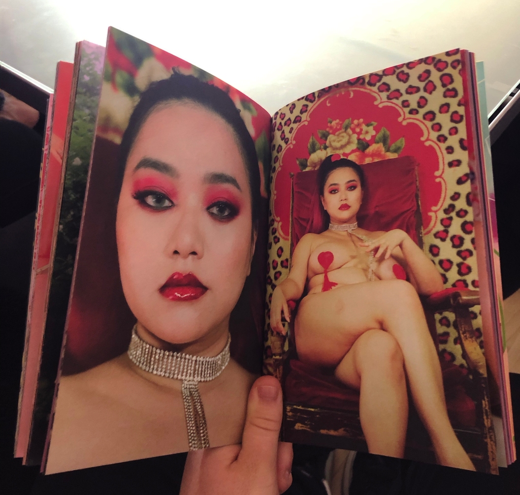
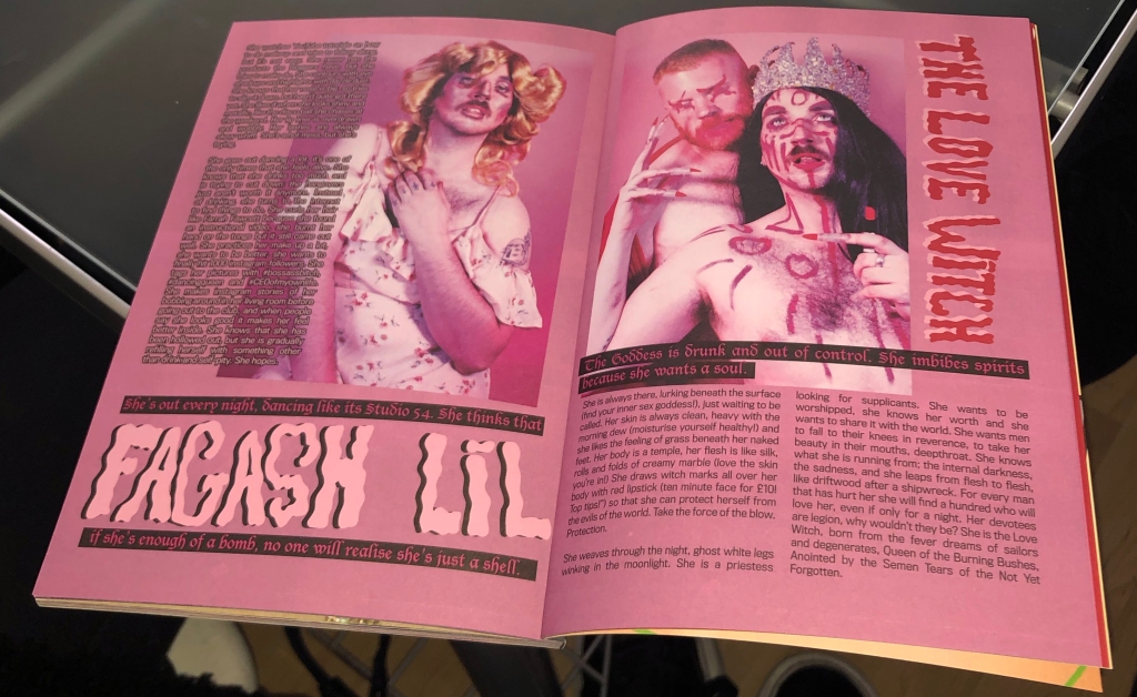
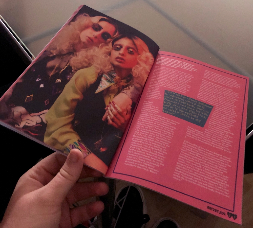
We had a lecture and workshop with one of the members of the Polyester magazine. She told us that around 30 people per issue working on it regularly. They need every help to make the professional edits and prints. Their zines are really high quality and it takes 3-6months to produce a single issue. As normal as it sounds, they use InDesign to make templates for the zines and then print it from there. She suggested a prinitng company that they use to print themselves which is the “Premier print group ‘. Overall, I learnt a lot about the distribution of zines and magazines which will come helpful in the future when I would like to publish a magazine. Polyster: Celebrating all things trash, kitsch and camp, Polyester is a London-based zine exploring feminism and gender identity through fashion.
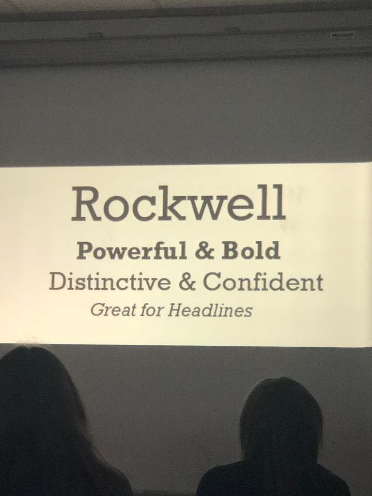
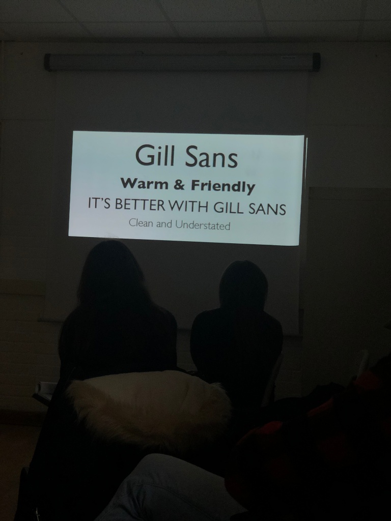
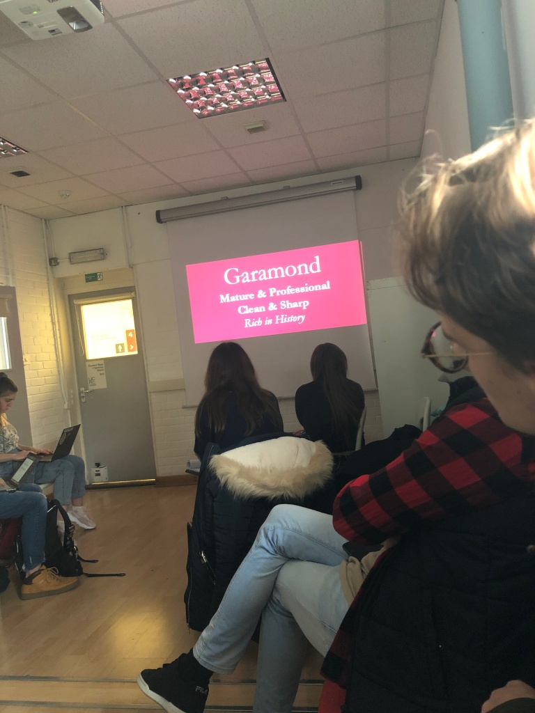
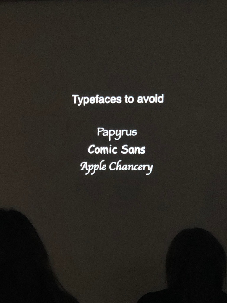
Lecture on fonts
Readability:
Text is for reading, so making my text legible Tiny/ Giant font sizes, crammed line height, or ugly and difficult to read fonts make the viewer’s experience of my book much tougher to understand and read.
Leading:
Leading, or the space between the lines of text, is an invaluable tool for readable text. Bad leading can ruin a good piece of copy, and good leading can make even the worst type up look readable for anyone. For large blocks of text, 1.5 times the size of text is a good size. Smaller text should have tighter leading, and a huge text should have a lot of it.
Colour:
I have to be cautious with colour, the contrast between the text and background is significant. I have to choose a combination that will be readable. Black on white backdrops are a standard, Yellow on pink would have been too bright and it would be hard to read. Colour may also be used in a photobook to reflect aspects of photographic work.
Popularity on fonts:
Helvetica, widely seen as the most popular 20th Century font only started to grow its fame in the late 20th Century when it was distributed on Apple Mac computer and was more an appreciation of the 20th Century modernism.
Editing:
I learnt I shouldn’t be afraid to cut, then edit and see how it looks, also I got to make drafts and copies and re read so I give my best in the final results.
